New release of VAPS, VPS, and VJS for Business Central
We have released new versions of our extensions for visual scheduling in Microsoft Dynamics ...
Read More
We have released new versions of our extensions for visual scheduling in Microsoft Dynamics ...
Read More
As promised in the last post of our new blog series about mastering SMB manufacturing with powerful ...
Read More
Here comes part two of the blog series about "Mastering SMB manufacturing in Microsoft Dynamics 365 ...
Read More
In the dynamic world of global businesses, the pursuit of enhancing organizational efficiency and ...
Read More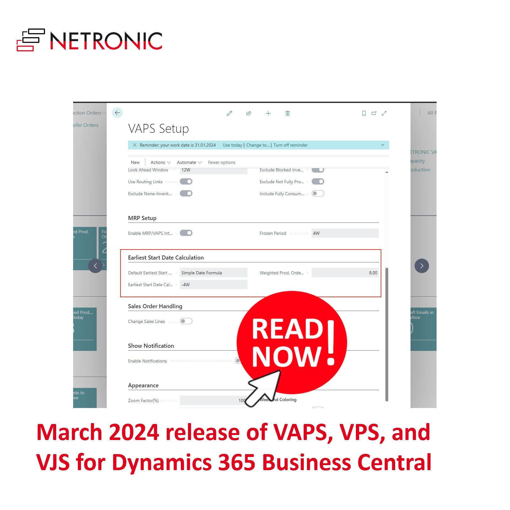
We have managed to get the new versions of our extensions for powerful scheduling, Visual Advanced ...
Read More
In episode 35 of his podcast, Martin welcomed Martin Blaha from the Czech Republic, who moved to ...
Read More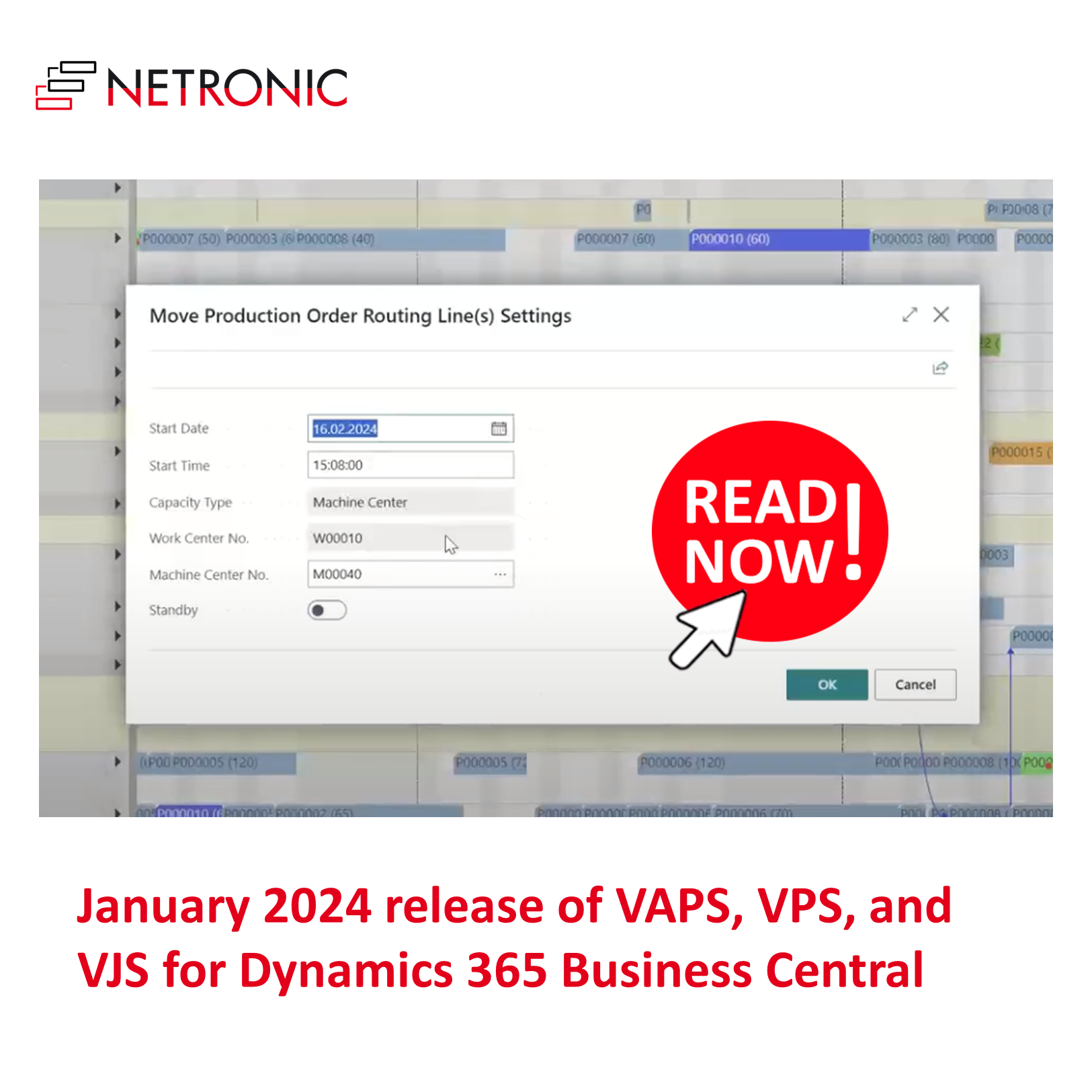
Some weeks ago, we released new versions of our extensions for visual scheduling, Visual Advanced ...
Read More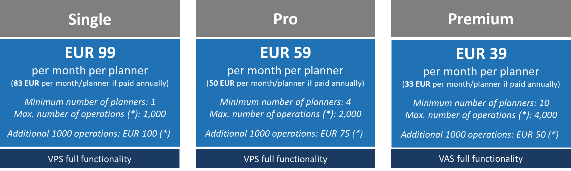
We will be changing the subscription pricing for our Visual Scheduling Extensions VPS and VJS. ...
Read More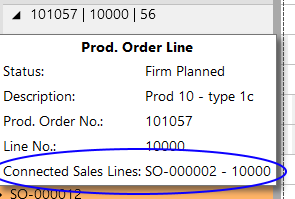
Some weeks ago, I informed you about the new versions of both the Visual Production Scheduler and ...
Read More
Participating in industry conferences is always a rewarding experience to me, we get a unique blend ...
Read More
Lately, we have released version 1.20 of the Visual Production Scheduler (VPS) and the Visual Jobs ...
Read More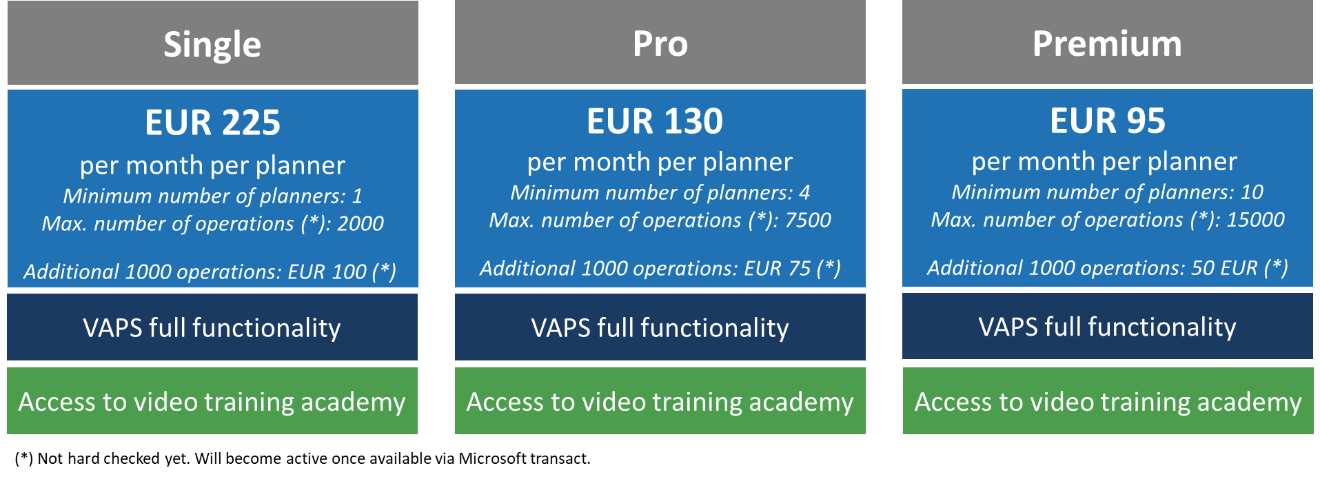
We are changing the subscription pricing for the Visual Advanced Production Scheduler (VAPS) with ...
Read More
In episode 34 of his podcast, Martin welcomed José Miguel Azevedo, a Microsoft Dynamics 365 ...
Read More
In his latest podcast episode, Martin hosted Ivar Keskpaik, who, amongst a plethora of other roles ...
Read More
In his latest podcast episode, Martin was pleased to welcome Andrew Good, CEO of Liberty Grove ...
Read More
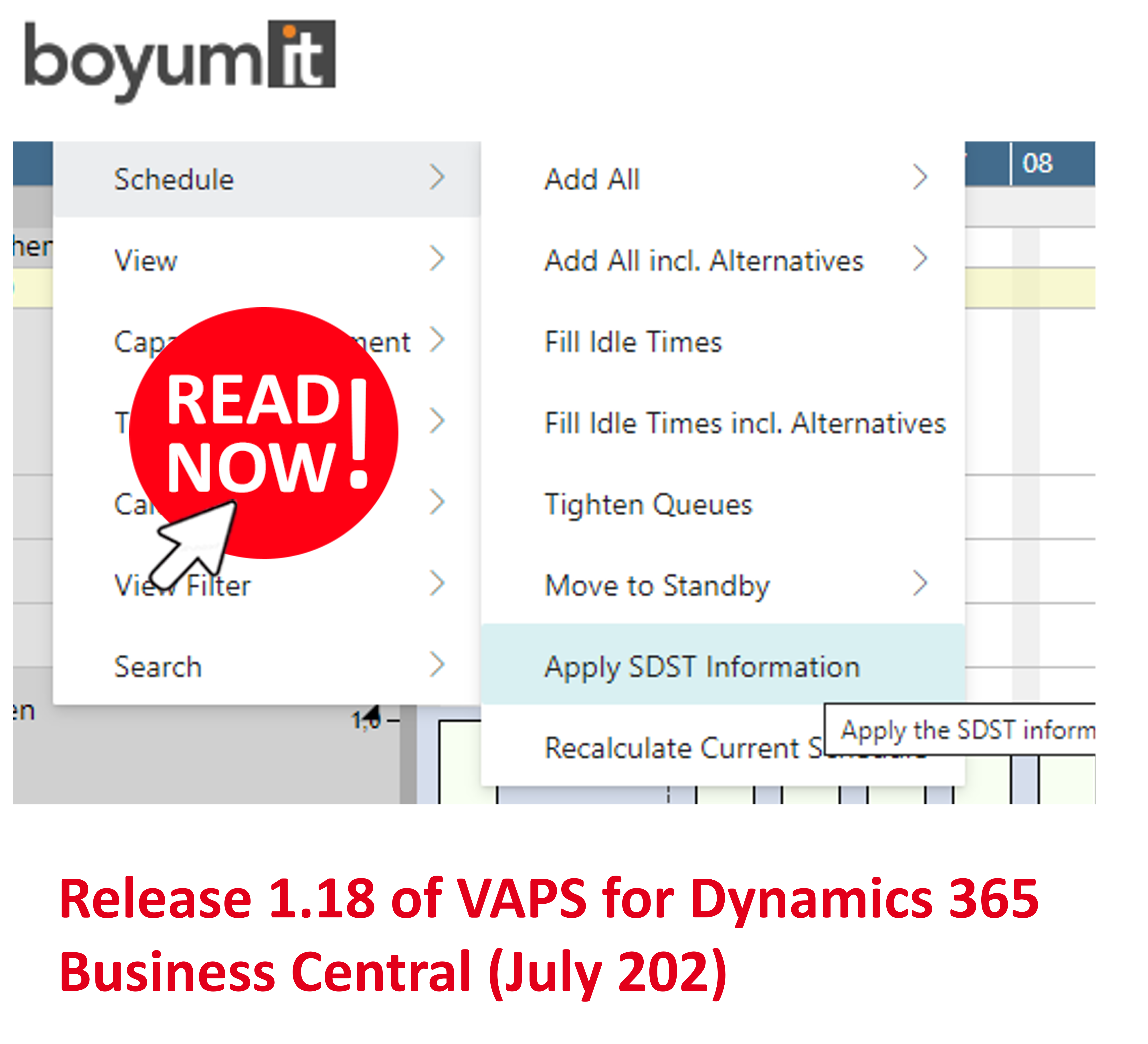
Just in time before the summer break we have released version 1.14 of the Visual Advanced ...
Read More