
With version 7.0 of the Visual Scheduling Add-ins Developer Tools (short: VSADT) we publish, besides some minor enhancements, a new view type that allows to structure resources depending on their skills.
At the beginning a word about the only breaking change of the new version: Please note that there is now no fallback of allocation property values to activity property values by default. For example, if an allocation did not have its own color, it was previously colored with the color of the activity to which the allocation referred.
We decided to change the behavior since this improves the performance when updating activities. Also, many customers did not use these fallbacks at all. If the old behavior is needed for your application, you can re-enable it by setting DecouplingOfAllocationPropertiesFromActivities to False.
A new view type – The Skilled Resources View
This is by far the most important enhancement of this VSADT release. Production planning requires a wide range of skills from resources – regardless of whether they are machines or resources. Therefore, it is obvious that VSADT also provides a view focused on this aspect of resources.
The new view of type SkilledResources is a special kind of resources view and shows resources grouped by skills. These skills can be defined by objects of type Skill. Analogous to all other VSADT object types, you can handle these objects with the methods AddSkills, UpdateSkills, and RemoveSkills
Skill objects are displayed as rows – similar to resources. And the resources that belong to a skill are positioned below its row.
To define skills for a resource, the resource property SkillIDs can be set an array of strings listing the corresponding skill IDs. Since a resource can have more than one reference to a skill object, it is possible that a resource is displayed multiple times, once for each skill.
Similar to how resources can have skills, allocations can have them as well. However, each allocation can have only one of them (see allocation property SkillID). This allows you to determine which skill of a resource is required or claimed for processing an activity.
In the new view, each resource row shows all allocations associated with the corresponding resource. That is, those allocations that have no skill assigned to them are also displayed. To make them visually distinguishable from the allocations with skill, their design can be altered by the setting AllocationBarDesignOfOtherSkill, for example, to tone down their colors (see setting onedDownOverlayColor) or to reduce their heights (see setting educedBarTopOffsetAndHeightScaleFactor) so that they are less noticeable.
Please note that the following limitations apply:
- Only the resources of the first level of the resource hierarchy are considered, i.e., the resources with no
- Resources that have no skills assigned to them are ignored and not displayed in the SkilledResourcesView.
- An unknown skill ID set to a resource is also ignored.
The following figure gives you an impression of what such a view looks like:
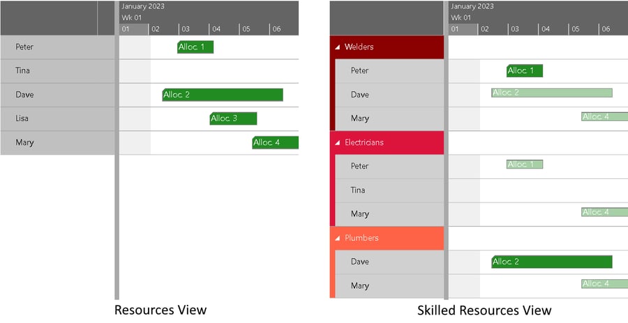
Here we see on the left side a Resources View with five resources and four allocations assigned to them. In the Skilled Resources View on the right side of the figure above, we see three skills (welders, electricians, and plumbers) with the associated resources. Lisa is not shown in this view, because she has no skills. Peter is referenced by Allocation 1, which requires the skill of a welder (see the green bar). Since he is also an electrician, a second bar is displayed for Allocation 1 below the electrician skill (see the small pale bar). In a similar manner, Dave and Allocation 2 are treated. For Mary, the bar representing Allocation 4 is drawn pale for each skill because no skills are required for that allocation. Tina is listed in this view because she has a skill, regardless of the fact that she has not been assigned any allocation.
Streamlining and simplification of the API
For an application developer, not having to deal with APIs that are too complex or difficult to use makes their daily work easier. With this in mind, the following changes have been made.
- The prefixes “PM_” and “AddIn_” have been removed from object property names. However, there is no need to change existing code immediately as the former notation will continue to be supported for compatibility reasons. You can delete the prefixes in your application with a global replacement.
Note: Avoid using both notations for the same object property at the same time. For instance, if you have an activity object with the property Color set to "red", then the subsequent setting of the PM_Color property will have no effect – the activity bar will remain red – since the new notation takes precedence.
Please also make sure not to use property names for your own properties on the data objects that might conflict with ours. Our property names always start with a capital letter. Please use a prefix like a special character or "App_" or start with a lowercase letter. - The word "nonworking" is now consistently used in exactly this spelling in the documentation and can thus also be used in the application source code. In the code, it is still allowed to use "nonWorking" everywhere.
- The event OnLogWarnings has now the new prefix “code:” in the description texts. It is used to pass a warning code to help developers to understand why the warning has occurred. Possible codes are listed in the new enumeration WarningCode. As part of this enhancement, new warnings have also been included. In the future, the warnings will be added gradually.
- For reasons of symmetry, the allocation objects now also provide the BarPatternType and BarPatternColor properties in the same way as the activities.
Reducible complexity of bars to gain performance
Performance improvement is an ongoing topic for us. This time we have created a possibility to reduce the complexity of bars by a switch in such a way that an increase in performance can be achieved.
For this, the new property BarDesign has been created for activities and allocations. Here you can specify in great detail which elements of a bar should be displayed. The values of the BarDesigns enumeration can be combined by using bitwise OR operators for this purpose:
   Simple: 0

   Default: 65535

   DefaultReduced: 16711680,

   Entries: 1

   ComplexShape: 2 // actually only Regular is changed to Rectangle when unset

   Symbols: 4

   Status: 8

   Constraints: 16

   ReleaseAndDueDateSymbols: 32 // ignored on allocations

   Baseline: 64 // ignored on allocations

   ProgressAndPredictedEnd: 128

   Text: 256

   TonedDownColoring: 65536 // see setting TonedDownOverlayColor

   ReducedHeight: 131072 // see setting ReducedBarTopOffsetAndHeightScaleFactor
Instead of specifying the design individually for each activity or allocation, you can also use the settings DefaultActivityBarDesign and DefaultAllocationBarDesign for setting a default design.
If your code still contains the allocation property For the value 4 this is without after-effect, for other values which were marked as deprecated for a long time, changes to the application are necessary. If this is the case, please contact us in case of difficulties.
More flexibility in showing texts
There is a wide range of new options and properties for
- New setting The keys of this map serve as variable names that can be used everywhere where text can be formatted (see below).
- New text formatting properties BarTextFormat of Activity and Allocation objects, and
- Inside the new text formats, the new accessor […] for property accessor strings allows you to get access to arrage or map content with dynamic value inside the brackets.
- The DateTimeFormat and Intl.NumberFormat.
Extended possibilities for the graphical representation
The following enhancements to options and object properties are related to the graphical representation:
So far, when using the grouping feature of VSADT, it was possible to color table rows depending on their grouping level. To improve usability, the new property TableColorVisibleInTimeArea for the GroupingLevelDefinition object allows to color also the row in the time area with the same color as used in the respective table row.
The following figure compares the previous representation with the new one:
- When working with hierarchical structures of activities, resources or entities, and the levels are all colored in the same color, it used to be very difficult to visually distinguish the different hierarchy levels within the table part. The new setting SeparationLinesInColoredIndentation remedies this shortcoming. As you can see in the illustrations below, additional vertical lines help the eye to grasp the layers more quickly:
- The height and width of symbols in table cells are now definable by the new properties SymbolHeight and SymbolWidth for the TableCellDefinition objects.
- The new setting ApplicationStyleDefinition expects a string to be injected into the HTML page as content of an HTML style element. This can be used, for instance, for defining CSS custom properties.
Assuming this option is set to "#root {--my-color: magenta}", the following is generated in the page:
<style>

   #root {

       --my-color: magenta

   }

</style>
Now we can refer to this CSS custom property when defining the color of an activity bar, for example:activity.Color = "var(--my-color)";
The smart thing about this approach is that you can easily change the styling via CSS without having to change or replace a CSS file. For more information about using CSS custom properties in VSADT, please see also this blog post (originally for our HTML5 product VSW), but usage is analogous in VSADT).
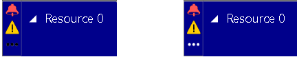
Of course, applications can also insert CSS styles themselves into the DOM tree. The advantage here, however, is that the variables from the setting ApplicationVariablesMap can also be used via the notation ! - The color of the three dots in the table symbol column was always black. To improve the readability, the dots now are automatically colored white if the background color of the symbol column cell is a darker one. The next figure shows a comparison between the old and the new representation:
- The height of the curve panes can now be globally altered by the new setting DefaultLoadCurvePaneHeight or for a specific resource by the resource property LoadCurvePaneHeight.

Features in previous releases