Whether project management, production planning or simply coordinating employees for service calls - for scheduling a graphical planning board is the ideal tool to work with. For Microsoft Dynamics 365 Business Central we offer ready-made graphical planning boards for both production scheduling and project/resource planning which fully integrate into the ERP system. If these extensions (or Add-ins for previous NAV versions) are not enough for your scheduling processes, you can use our Visual Scheduling Add-in Developer Toolbox (VSADT) to develop your own planning board, without any knowledge of HTML5, but only with the help of AL (or with C/AL, if you are still using NAV). We have now extended our "toolbox" with some important visualization functions, which I would like to present to you now.
Save plans as PDF and print
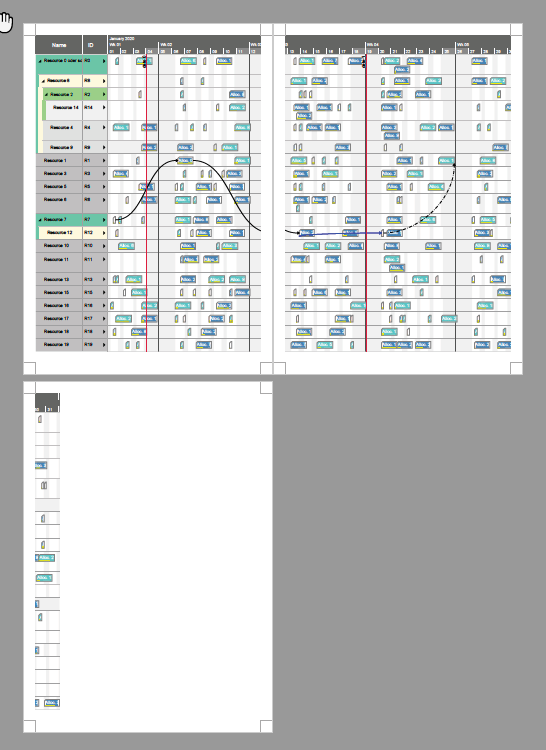
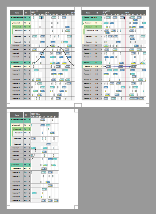
In practice, it is still the case that people like to have a plan in front of them on the table during meetings or want to mail their planning boards as pdfs. Therefore, with Visual Scheduling Add-in Developer Toolbox 5.0 you can now also save your planning board ad pdf and print it. Because the plans often can not be summarized on one sheet, we have built in three different print modes:
#1 Single print mode
Print your planning board on one single sheet and the size of this sheet is determined by the size of the chart.
#2 Print mode with cutting marks
Output the diagram on several sheets. Additional cutting marks make it easy to reassemble the overall diagram from these sheets.
#3 Paging print mode
Output the planning board on several sheets. But here additionally on each sheet both the associated table section and the associated time scale section are printed. This is a very helpful feature if your focus is not on the entire chart, but if you want to consider the chart section by section.
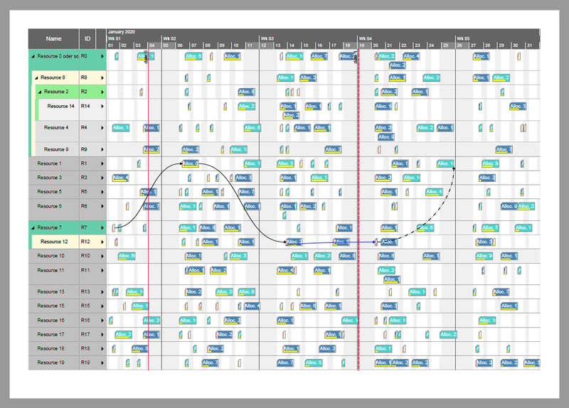
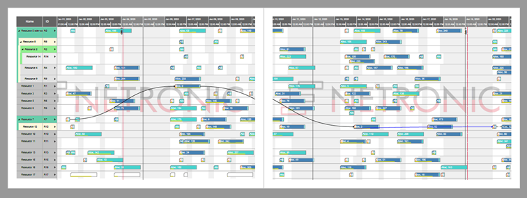
Visualize activities and their allocated resources in one view
Previously, you could generate two views with the toolbox - a view that is focused on orders (orders in the table on the left hand) and a view focused on resources (resources in the table on the left hand). For the cases where you wanted to view the orders and their activities plus the allocated resources at the same time, you always had to switch back and forth between the views. Now you can create the resource allocation as an additional row in the order view and thus view the operation/task/activity plus the associated resource at a glance.
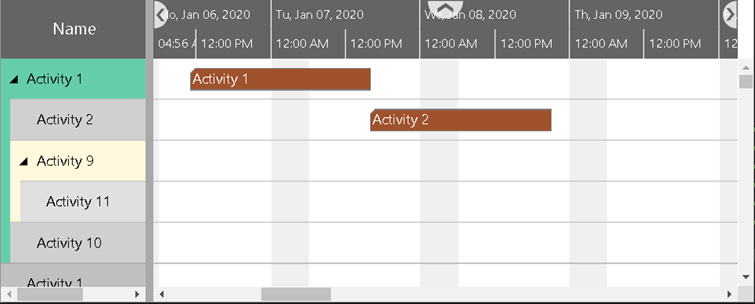
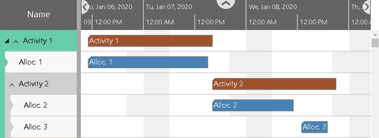
In the sample above, for Activity 1 only one allocation was found, whereas two allocations were detected for Activity 2. As you can see in the table at Activity 1, there is now another arrow. The left black one is for collapsing and expanding the nested activities, the new right arrow is for collapsing and expanding the allocation rows.
The allocation rows in the Activities View can be controlled by analogous options like the activity or resource rows. For instance, you can specify
- which table row definition an allocation row should use,
- whether it can be selected or collapsed,
- the minimum row height, and
- the design for collapsed and expanded rows.
Add watermarks to the planning board
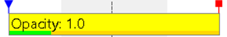
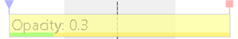
Sometimes you will have the desire to insert, for instance, the logo of your company in the background of your diagram. Or you may want to inform the user of your diagrams that the data to be seen is secret. For both situations, the toolbox offers a solution by giving you the opportunity to use symbols as watermarks. Also, you have the option to reduce the opacity of the symbol so that it becomes paler and less prominent. In the following figure, the opacity has been set to 0.2 (default) and 0.6, respectively:
When you save the planning board to a PDF file, the watermark is printed as well, of course. But in this case, it will be placed in the center of each sheet, as you can see in the next figure for a PDF file with two pages:
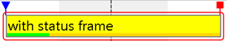
More design options for the bars in the planning board
We have extended the options for designing the activity and allocation bars. You can now set the opacity of the bars. Reducing the opacity affects the entire bar, that is, also the borders, the progress bar, the symbols, and the constraint dates:
As you can see, this feature is especially useful for visually reducing bars, for example, when they have less importance than the rest of the bars.
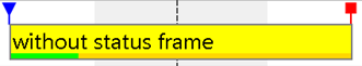
To even more highlight a bar, you can add a frame around it:
Add colors and symbols to the table of the planning board
Color your table row cells
Many customers were missing an option to highlight only a single cell in a table row, so we implemented this feature in the toolbox now. In this sample we defined the background color for the second table row as red:
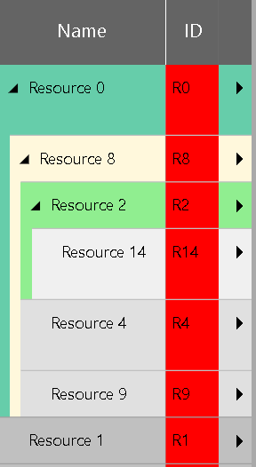
But this is not flexible enough! In most cases, you do not want to color all cells of a column, but only certain cells depending on the specific data of a table row. You can now also define a reference to a property of the current data object, from which it can take the respective desired color.
Of course, all this makes only sense if you can also alter the color of the cell texts to ensure that all texts are readable in any case. Altering our sample accordingly – we have set “white” for the text color – results in:

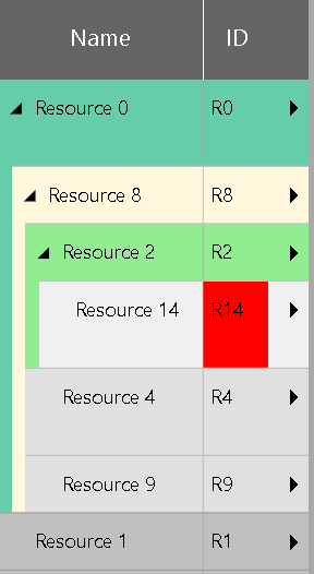
Add symbols to column
The next improvement is related to the title of the symbol column. This column is a valuable tool for “projecting” important events that occurred anywhere within a Gantt row or entities table row to the very beginning of the corresponding row. We have now taken this idea further and also created the option for the symbol column title to display symbols there in the same way. This allows you to project important events from inside the symbol column onto the column title.
The next two screenshots show the difference between invisible and visible symbol column titles:
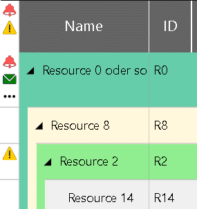
Define the width of the table row more flexible
So far you could only set the table view width for all three view types (Activites, Resources and Loads View) at the same time. Now you can define the width for each view separately. If the user changes the view width of the table in one view type, you can define whether the widths in the other views will be adapted as well, or not.
Miscellaneous
From version 5.0 of the Visual Scheduling Add-in Developer Toolbox you can define links not only between activities but also between allocations.
Instead of removing all objects that have been added before, you can now specify which type of objects you want to remove. This way you do not have to collect all the objects to be deleted or their identifiers in an array to invoke one of the type-specific remove methods with them.
Finally, you can now determine the time delay in milliseconds for triggering the callbacks.

Free e-book about a Gantt chart scheduler for D365 BC