
The Visual Scheduling Add-in Developer Toolbox (VSADT) is a Gantt control add-in for Microsoft Dynamics 365 Business Central and fully integrates with the ERP system. ISVs use the VSADT in their business solutions to visualize their data in form of an interactive graphical planning board. You develop your individual Gantt chart only by using AL code.
Today we released Version 6.3 of the VSADT. Among others, you can now intuitively drag & drop rows in the table part of the Gantt chart. Learn more about the new features here.
Intuitive drag & drop of table rows in the Gantt chart
Although VSADT is offering a great bundle of possibilities to interact with the chart, one important thing was missing so far: drag & drop of table rows. This feature is highly valuable when quick and easy interactive restructuring or reordering of the data displayed in the table part is required.
The challenge with this feature was to find the most intuitive way for the user to do his work, especially when working with hierarchical structures.
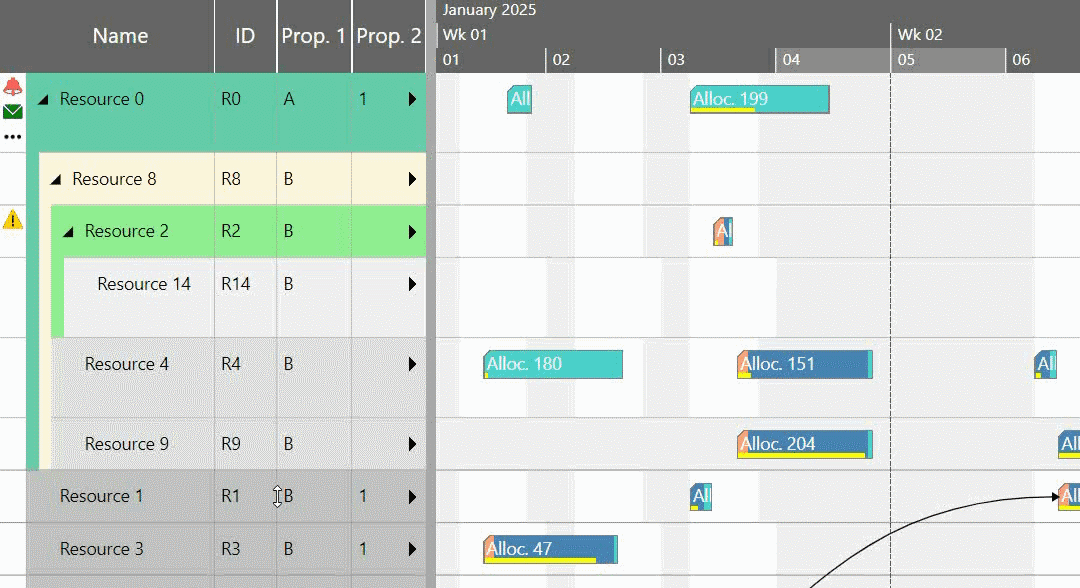
To enable this feature globally, the options PM_DefaultActivity/Entity/ResourceAllowedRowDragModes have been added. If one of these options is enabled, then you can drag the rows in the activities view, resources view, and entities table, respectively. You only need to press the left mouse button on a row and keep the button pressed. A row phantom appears, and you can start dragging.
There are two indicators that will help you easily determine the new position of the row when dropping the phantom:
- First, there is a horizontal line in the table exactly where the row should be placed. This orange line starts with an arrow to make it easier for the user to see whether the row will be on the same level or one level below the row that is currently hovered with the mouse cursor, i.e., as a child row:
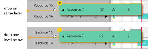
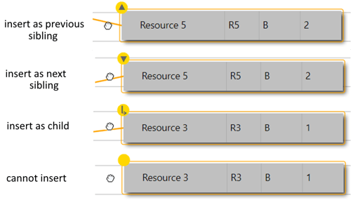
- Secondly, a special indicator at the top left of the phantom gives additional information about the concrete new position:
In addition to globally enabling drag & drop of rows, you can of course also specify on a row-by-row basis whether they can be dragged or not. The activity, entity, and resource properties PM_AllowedRowDragModes are intended for this purpose.
Very often, different levels in a table contain different types of data. In this case, it does not make sense to allow the user to drop a row at each position. Instead, for example, a row from level x should only be droppable at a new position with level x. For this, the drag mode DragOnSameLevelOnly is provided. By enabling this mode, the phantom will switch to “cannot insert” (see figure above) to guide the user.
As already known from interactions with bars, the application is informed by events throughout the interaction process. The callback functions canDrag, onDrag, and onDragEnd are triggered as far as they are defined by setting the corresponding options.
As soon as the user drops a row, the application has to process this interaction and restructure the data accordingly. If the application has specified a sort code using only one property by using one of the settings AddIn_ObjectSortCodeSources with 'Object' being the type of the visible row objects, and ascending sort mode is defined and the values contain integer values, control add-in pre-calculates the new sort codes of the dropped row object and eventually also of its siblings automatically. In this case, these calculated values can be found in the arguments of the OnDrop event. Thus, all information an application needs to update its own sort codes in response to user interactions is available.
Performance enhancements
Although performance enhancement is a continuous task in our daily development, this time we have focused on three special topics, some of which also affect the API:
- Concerning property AddIn_Visible for objects of type Activity, Entity, Allocation, Resource: VSADT can now save time when filtering because the number of objects to be processed in each case is reduced. Only objects of the same type are considered when evaluating the filter
- Following the same intention and principle, the settings AddIn_ObjectSortCodeSources with 'Object' being the type of the visible row objects now are handled type-wise and therefore show increased performance overall.
- The performance of the Add-, Update- Activities/Resources/Entities methods when processing hierarchies by using the ParentID properties of the concerned objects have been significantly improved.
Easier setting of default values
It is annoying and causes an unnecessary amount of data transfer between web server and client when all objects of a certain type have a property with the same value. For this, there are now the options DefaultValuesForObjectProperties with 'Object' standing for Activity, ActivityEntry, Allocation, AllocationEntry, Entity, Link, and Resource.
The type of these options is Object. You can create a JavaScript object with properties that are specific to the object type for which you want to set the default values.
For example, if you set the following object as the DefaultValuesForActivityProperties option, by default all activities will be colored green, and the user will only be able to resize the activity bars on the right side (i.e., at the end). Any other interaction with the bars, such as moving them, will not work.
{
PM_Color: "green",
PM_AllowedBarDragModes: 2 /*ActivityBarDragModes.DragEnd*/
}
One additional note regarding the evaluation order of the object properties:
Depending on the property we are considering, we now have a maximum of three ways to set up a property. These settings are evaluated in the following order and the evaluation process stops as soon as a defined value is found:
- Setting a property directly on the object itself, for example,
Activity.Add["PM_BarHeight"] = 20; - Setting by the new default value objects, for example,
defaultActivity.Add('PM_BarHeight', 40);
settings.Add('DefaultValuesForActivityProperties', defaultActivity); - Setting a specific option, for example,
settings.Add('PM_DefaultActivityBarHeight', 30);
If none of these three ways is used to set a property, the values defined internally in the VSADT are applied.
Status areas above and below the chart area
Sometimes it is desirable to have an area where you can attach additional information to the chart. For example, think of a title, status information, company logo, or any key performance indicators (KPIs). For this purpose, the control add-in now provides a status area above and below the diagram respectively.
The AddIn_TopStatusAreaContent and AddIn_BottomStatusAreaContent settings allow you to define any HTML content that will be placed at the respective positions. With the AddIn_TopStatusAreaHeight and AddIn_BottomStatusAreaHeight you can customize the height of these areas.
The full flexibility can be achieved by the AddIn_StatusAreaVariables setting. Using this setting, also dynamically generated information can be added to both areas. You only need to define a JSON object whose property names define variable names. These variable names can be used in the HTML strings. Just surround them with double curly brackets. At runtime, these placeholders will be replaced by the actual values. Values that are not of type Text (Integer, Decimal, DateTime) are converted to strings.
Have a look at the following sample:
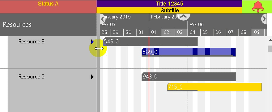
Here we see a top-status area built from several DIV elements. The code snippet below shows you how to create such an area.
<div style="background: indianred; color: gold; flex-basis: px;
<div style="display: flex; flex-direction: column; width: 70%;">
<div style="background: indigo; color: yellow;">Title </div>
<div style="background: gold; color: black;">Subtitle</div>
</div>
<img width="15%" height="33px" src="">
As you can see, three variables are used (see the bold texts in the snippet). The first one (TableViewWidth) determines the width of the red field (Status A) and is updated as soon as the user drops the splitter when resizing the table part. This way, the red field has always the same width as the visible table area. The second variable (Property1) is used to dynamically change the text in the violet field. The third variable (@Alarm) specifies the icon to be displayed in the green field, where the @ symbol indicates that the variable name refers to a symbol object (see also the AddSymbols method).
Enhancement to the context menu item
The ContextMenuItem object has undergone two minor enhancements:
Additionally to the property SymbolID there now exists the property SymbolIDSource that allows to get the symbol ID by using property values of the referenced object similar to the formerly already existing DisabledSource. And the properties DisabledSource and SymbolIDSource now support referencing properties of sub objects by using a syntax like “PropertyBag.PropertyName”. There is also more than one level allowed.
Better support for developers in error handling
Of course, when developing an application with the control add-in, developers sometimes face the problem that when calling API methods or setting options, some errors occur in the widget due to wrong or missing parameters.
To give the developer better help to quickly master such situations, we have added two new events: OnLogError and OnLogWarnings.
The event OnLogError is called as soon as an exception occurs within the control add-in. The argument object of this event gives you further information about which method or setting has failed, as well as more details about the error. By default, an exception is re-thrown after the event has been processed, but you can prevent that by returning a special flag.
Another situation where the OnLogError event is triggered is when the application itself causes an exception while processing a control add-in event and does not catch this itself.
In a similar way, the OnLogWarnings event works. It is triggered when data is inconsistent. The argument object informs you about the name of the method that failed along with an additional description of the cause for this trouble. Samples for such descriptions are "Option 'xyz' is unknown", "Object ID empty", or "Object with ID 'xyz' not unique".
Another very interesting use of these new events is to record them (ideally along with other parameters such as user, session, application, etc.), to reproduce the issues later. Or the system could send an email to the system administrator to notify him that something went wrong
Miscellaneous
There are some other extensions:
- New property PM_BorderDashArray of Activity and Allocation objects.
- Symbols on date lines are now also placed in an optimized way.
- Automatic detection of duplicate IDs and cycles in the hierarchy when using ParentIDs on adding or updating objects resulting in a warning and additionally in an exception in the latter case.
For further details, please check the Changelog chapter in the Interface Definition Document (IDD), which is included in the download.

Features in previous releases