If you talk to enough people within a certain industry, do enough presentations, read enough blogs, you begin to draw certain conclusions of the time. My conclusion of the time since joining NETRONIC two years ago has been this: the visual scheduling add-ins we build for Microsoft Dynamics NAV are no longer a 'nice-to-have' for customers, they are a 'must-have.'
This blog post will dive specifically into the Visual Production Scheduler for Microsoft Dynamics NAV and the features which must be shown during demos to really win over prospects.
The general consensus is this: it's not the case any more that a prospect or customer is wowed just by seeing a visual representation, namely a visual schedule in the form of a Gantt chart, of their data. It's an expectation.This means two things.
First, it means that a visual proponent of your demo is a must else you risk immediate loss of position against competition who come prepared with visualization.
Second, it means that to beat out the competition you need to not only have a visual proponent, but a good one.
To quote Microsoft CEO, Satya Nadella,
We are moving from a world where computing power was scarce to a place where it now is almost limitless, and where the true scarce commodity is increasingly human attention.
This means you need to show more quality in less time. Not easy but doable with the right tools.
Therefore it is to be expected that I, the presenter of the Visual Production Scheduler for Microsoft Dynamics NAV Manufacturing module, will often hear reactions to three key features I always show during demonstrations.
These features are for me the basis of presenting the Visual Production Scheduler and its capabilities in NAV. My goal here is to explain and show them so that the next time you are demoing them you will be able to give the best possible demo.
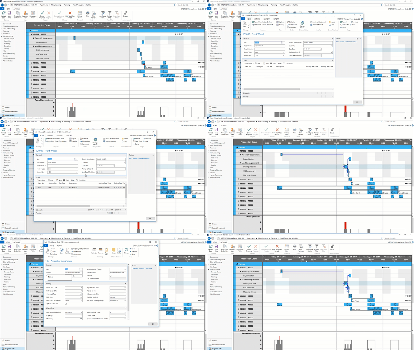
Feature 1 - Seamless Integration: double-clicking anywhere in the schedule takes you to the corresponding tables and cards in NAV.
Okay, this starts off our list because this gets all the heads in the room nodding. Any initial inhibitions from those who are hesitant to "learn something new" can be addressed by showing the ease with which one can jump from the visual schedule back into NAV. In essence, your customers and prospects should never feel like what you are showing them is even an add-on.

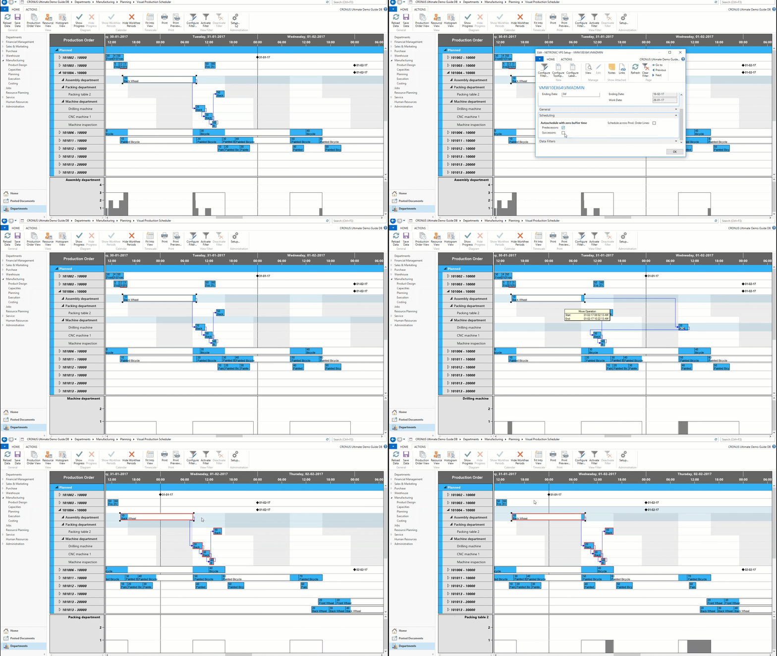
Feature 2 - Semi-Automatic Scheduling: auto-schedule predecessors and successors with zero buffer time.
Seems intuitive once you see it but this feature is not to be taken for granted. This is a semi-automated feature which allows you to move single operations and then see the results on either the preceeding or succeeding operations, or both. This is direct planner decision support inside the add-in - it's as easy as turning a light switch on or off.

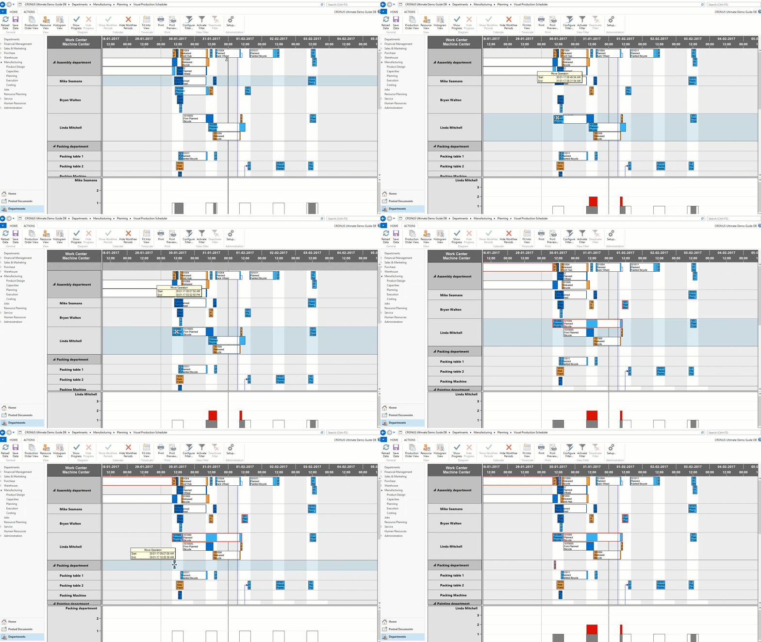
Feature 3 - Dragging & Dropping across
Machine and Work Centers: move operations horizontally or vertically across the screen to adjust timing or routing.
This is the big one. It shows one of the true strengths of a visual schedule of your data, namely the ability to quickly move data around that would otherwise be cumbersome. Here we see how easy it is to shift work from a overloaded resource onto other available resource in that group.

Review
Okay so three key features to highlight when showing the Visual Production Scheduler.
Feature 1: Seamless Integration
Feature 2: Semi-Automatic Scheduling
Feature 3: Dragging & Dropping across Work and Machine Centers
Build your presentation around these and you can't go wrong.
Further reading:
Decision Support for Production Scheduling in Microsoft Dynamics NAV
10 Links That'll Make You Smart on Dynamics NAV Production Scheduling
Comprehensive Guide for Microsoft Dynamics NAV Manufacturing Module

