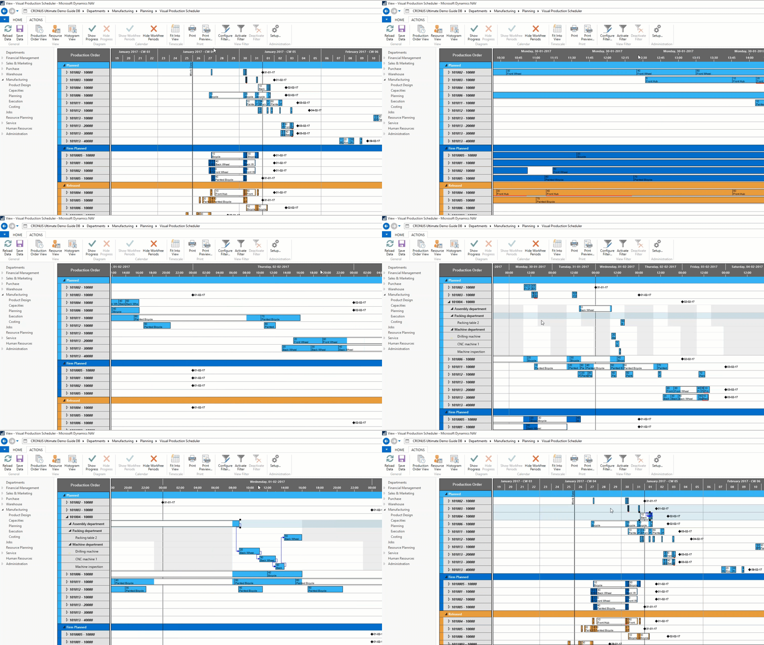
One of the most underrated and misunderstood aspects of NETRONIC Visual Scheduling in Dynamics NAV is the ability to either drill down or pan out quickly and effectively across large amounts of data. However, only having the ability to move in and out doesn't mean it's going to automatically bring value. The value comes in knowing how to use it.
The focus of this blog post is to break down the ways in which adjusting the resolution of your data effectively changes your perspective, and the amount of relevant data shown. This, in turn, unlocks the vast reservoir of value that lives within your data.The Wheel of Agility: How to use the wheel of your mouse
Few inventions have revolutionized the world more than the wheel. It has done so much for humanity in terms of bringing us forward in fact, that it's almost impossible not to interact with one on a daily basis.
If you drive a car, use a computer, or push a cart through the supermarket then you're using wheels. They are so much a part of who and what we are that we barely ever stop to think about their impact. The wheel discussed in this post is also used every day by millions of people all over the world. It is small but hugely significant, not often thought of but always ready at your finger tip; it is the wheel of your mouse.
The Granularity Gain: Drilling down to value
 Though this wheel may seem small it is in fact huge in its implications in visual scheduling.
In a matter of seconds you can go from looking at production orders or projects over the course of months and years, to minutes on a given day. Nothing tabular can deliver such agile variability in data viewing.
Next time you want to drill down into your data in Dynamics NAV, try to make a mental note of how many clicks and dragging of scroll bars you need to go through to get there. It might seem quick but compared to rolling your finger over the wheel of your mouse to zoom in - it's not.
It's also important to remember that just because you can drill down into such small time intervals, it does not mean that it is always wise to do so. We all know the saying can't see the forest for all the trees and that certainly holds true here. Maintaining a high level overview of your data allows you to know when it makes sense to drill down and take a deeper look.
Hot Air Ballooning and Visual Scheduling:
It may seem odd that hot air ballooning should be included in this blog post but hang in there as it will all become very clear.
 If you've ever taken a ride in hot air balloon you know that the view from a few thousand feet above the ground is astonishing. This same happens when you're taking off or landing in a plane (Unless you're not in a window seat and the person who is in the window seat is taking up the whole window...!) The point is that what you see on the ground looks very different from up high. Single buildings become developments, a thought out plan. Farms become neatly organized grids and streets and highways vital vessels carrying people to and from their destinations.
This aerial view also affords the perspective of seeing which areas of a city or region are depressed, not well maintained, or overcrowded. The same is true for data.
While your mouse allows you to drill down into certain data, it also lets you roll in the other direction therefore giving a broader overview. It's very difficult to spot a bottleneck or capacity issue when you can only see one machine over the course of two hours. Zoom out from that granularity however and you will very quickly see where problems in your schedule are arising.
Conclusion: Flying with Binoculars
Both granular and broad views bring very little real value on their own. It's the combination of the two, achieved through the flexibility of the wheel on your mouse, that enables the real agility.

The process therefore is to begin high-up getting that hot air balloon view of your data. From here you can assess what needs to be looked at closer and where to zoom in accordingly. Be careful, though, not to get bogged down in drilling down. It's important that you frequently reassess at a high level as your schedule will no doubt change. The visual scheduler will give a planner everything they need to make agile and effective decisions. The decisions, however, ultimately will come from the planner.
Try to be a planner who gives themselves options and always remember to fly with binoculars!
This blog post was inspired by advice given by our good friends and partners @Tisskiltd. Have an idea or advice for a blog post? Let us know via the contact page and we will make it happen.
Further Reading:
The 3 Most Loved Features of the Visual Production Scheduler for Microsoft Dynamics NAV
Best Practice for Visual Project Planning in Dynamics NAV Jobs Module
Photo credit for mousewheel photo: Rodrio Senna on flickr

