
Resource load plays a key role when it comes to order planning. Planners have to ask themselves whether a certain resource has enough capacity on a certain day to work off a task. Usually, the capacity load is visualized by a capacity curve, also called histogram, in a Gantt chart. In this blogpost I‘ll introduce two other ways of displaying capacity load: by an own resource view and by a calendar view as is known from Microsoft Outlook.
Three ways to visualize capacity load
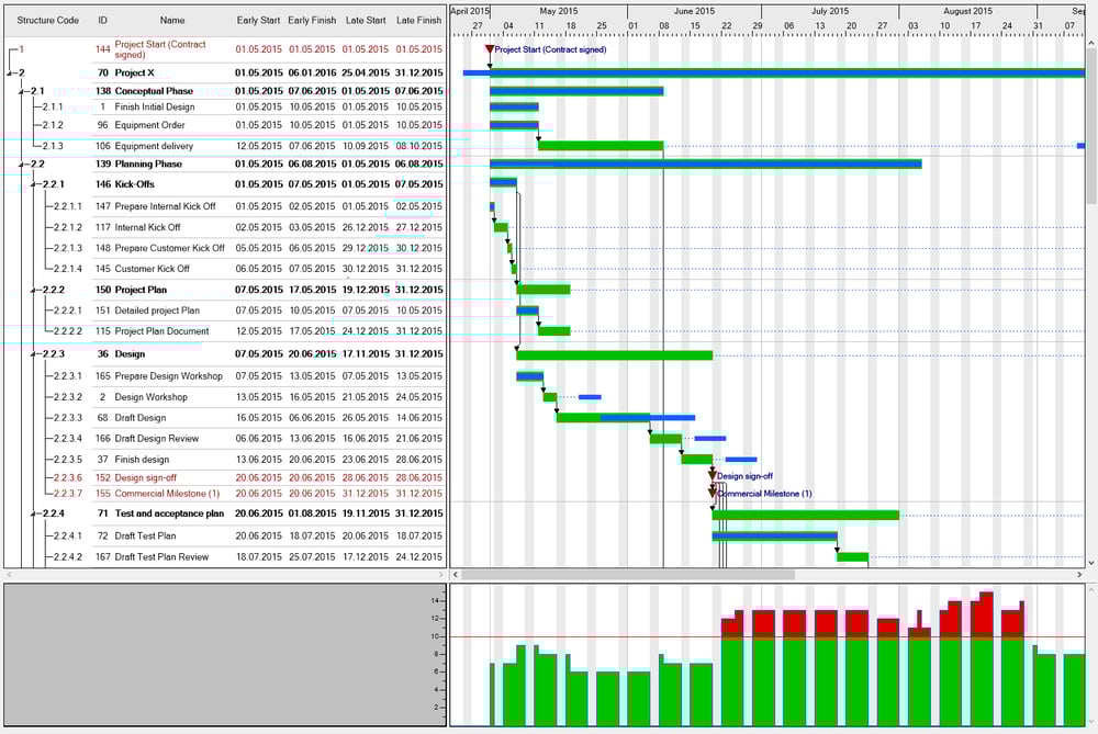
1) Common presentation: Capacity load as curve
The capacity curve below the Gantt chart shows the level of utilization of the according resource at a certain time. A line indicates the maximum possible load, calculated on the basis of the resource‘s working time. Loads that exceed this line are displayed above the line. In the example below that was developed with our Gantt component VARCHART XGantt these loads are either displayed in Green or in Red for reasons of a strong signal effect.
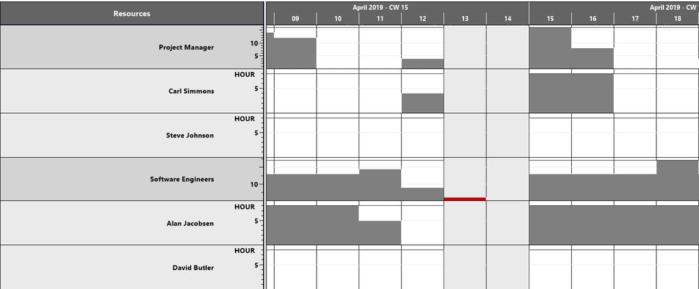
2) Resources shown in an own view
Our Gantt add-ins for Dynamics NAV offer an own view for the capacity load where the planner sees all loads of all resources at one glance so that he will be able to make faster decisions, e.g. in case of a bottleneck, whether another resource can take over some work.
This screenshot shows the Resource View of the Visual Jobs Scheduler:
3) Calendar view combined with capacity load
I doubt there‘s anyone who doesn‘t know the calendar view from Outlook where dates on a certain day are indicated by bold font.
Instead of working with dates, we show resources and their utilization in this view:
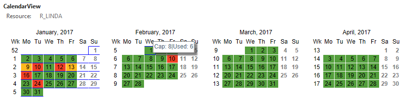
The meaning of the colors in detail:
- Green, if the utilization is lesser than or equal to 10%
- Yellow, if the utilization is lesser than or equal to 50 %
- Red for the rest
- A day will remain white If no capacities are specified for this resource at this day and the font color will be grey.
In addition, a tooltip gives detailed information on the capacity of this resource and how much is used:
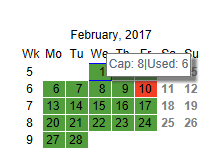
The picture above shows that six of the eight hours capacity of this resource have already been planned.
This view is part of a customer application we have developed in HTML5/JavaScript.
Which view is the best?
There‘s no visualization form that is best for illustrating capacity loads. Everything depends on the needs of the planner: Does he always has to have a direct relation to the resource‘s task as in example 1, does he simply want to have a total overview of the resource utilization of his machines for future or also past orders as in example 2, or is a rough overview of his resource‘s load enough for the time being to distribute his expenses? Of course there are further ways of visualizing capacity loads. You are very welcome to writing us if you come up with any ideas.
Those who‘d like to learn more about visualizing panning data, either for production planning, logistics, or for project management etc. can find some interesting blogposts here:
Manual order allocation - 4 backlog visualizations in planning boards
From Awful to Awesome Progress Visualization in Gantt Charts
Gantt Chart Tips&Tricks: How to design a stylish tooltip