
Gantt charts visualize tasks, resources or capacities along a timeline and so provide an optimum overview for planners. When designing them, one should keep in mind to directly show information that is essential for the planner so that he can quickly recognize planning conflicts and intervene. Showing too much information might jeopardize the clarity. That is why a tooltip is a good way of showing important data only if needed. What is true for Gantt charts also applies to tooltips: information has to be perceived quickly, meaning that it has to be presented in a clearly sorted and arranged way. This step-by-step guide shows users of our Gantt component VARCHART XGantt how to design a clearly arranged tooltip.
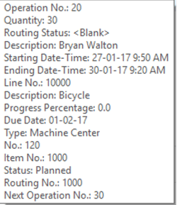
Confusing Tooltip
The design options of the tooltips included in VARCHART XGantt are limited concerning
- the arrangement of data field names and content in columns
- highlighting critical values depending on conditions
- showing symbols indicating certain states.
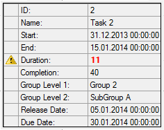
Easy to Read Tooltip
This is how the tooltip could look like of you bypass the limited design options with only little programming effort:
Step by Step Instruction
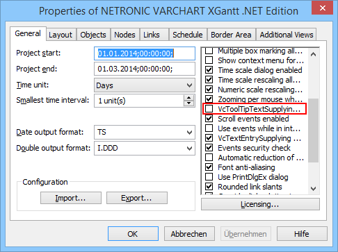
First, deactivate the VcToolTipTextSupplying event in VARCHART XGantt:
Then create a new form TooltipWindow in your Visual Studio solution. In the constructor of the form containing XGantt, the TooltipWindow gets configured by calling the SetTooltipWindowAttributes method. This method looks as follows:
TooltipWindow _ttw;
private void SetTooltipWindowAttributes()
{
   _ttw = new TooltipWindow(vcGantt1);

   //Settings for the Tooltip window:
   _ttw.StartPosition = FormStartPosition.Manual;
   _ttw.AutoScaleMode = AutoScaleMode.Font;
   _ttw.AutoSize = true;
   _ttw.AutoSizeMode = AutoSizeMode.GrowAndShrink;
   _ttw.ControlBox = false;
   _ttw.FormBorderStyle = FormBorderStyle.None;
   _ttw.MaximizeBox = false;
   _ttw.MinimizeBox = false;
   _ttw.ShowIcon = false;
   _ttw.ShowInTaskbar = false;
   _ttw.TopMost = true;
}
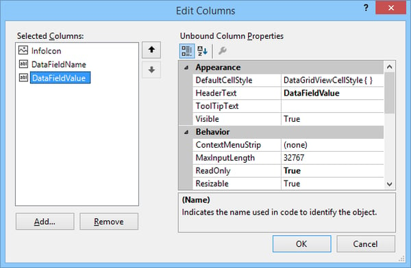
Now place a DataGridView on the TooltipWindow and call it TTDataGrid. In the Edit Columns dialog of the DataGridView create three columns:
In the constructor of the TooltipWindow, call the SetDataGridAttributes method and by this configure the TTDataGrid. The method looks as follows:
private void SetDataGridAttributes()
{
   //General settings for the data grid:
   TTDataGrid.AllowUserToAddRows = false;
   TTDataGrid.AllowUserToDeleteRows = false;
   TTDataGrid.AllowUserToResizeColumns = false;
   TTDataGrid.AllowUserToResizeRows = false;
   TTDataGrid.AutoSizeColumnsMode = DataGridViewAutoSizeColumnsMode.AllCells;
   TTDataGrid.ClipboardCopyMode = DataGridViewClipboardCopyMode.Disable;
   TTDataGrid.ColumnHeadersVisible = false;
   TTDataGrid.ReadOnly = true;
   TTDataGrid.RowHeadersVisible = false;
   TTDataGrid.ScrollBars = ScrollBars.None;
   TTDataGrid.ShowCellToolTips = false;

   TTDataGrid.RowTemplate.DefaultCellStyle.BackColor = Color.FromArgb(255, 240, 240, 240);
   TTDataGrid.RowTemplate.DefaultCellStyle.ForeColor = Color.Black;
   TTDataGrid.RowTemplate.DefaultCellStyle.SelectionBackColor = Color.FromArgb(255, 240, 240, 240);
   TTDataGrid.RowTemplate.DefaultCellStyle.SelectionForeColor = Color.Black;

   //Column 0:
   DataGridViewImageColumn dgvic = (DataGridViewImageColumn)TTDataGrid.Columns[0];
   dgvic.ImageLayout = DataGridViewImageCellLayout.Zoom;
   dgvic.ReadOnly = true;
   dgvic.Resizable = DataGridViewTriState.True;
   dgvic.DefaultCellStyle.NullValue = null;
   dgvic.DefaultCellStyle.SelectionBackColor = Color.FromArgb(255, 240, 240, 240);
   dgvic.DefaultCellStyle.SelectionForeColor = Color.Black;

   //Column 1:
   DataGridViewColumn dgvc = TTDataGrid.Columns[1];
   dgvc.ReadOnly = true;
   dgvc.Resizable = DataGridViewTriState.True;
   dgvc.SortMode = DataGridViewColumnSortMode.NotSortable;

   //Column 2:
   dgvc = TTDataGrid.Columns[2];
   dgvc.ReadOnly = true;
   dgvc.Resizable = DataGridViewTriState.True;
   dgvc.SortMode = DataGridViewColumnSortMode.NotSortable;
}
Moving the mouse over the VARCHART XGantt constantly triggers VcGantt_MouseMove events. In this event, you first identify the object type the mouse cursor is currently hovering on by the VcGantt.IdentifyObjectAt method.
If the mouse cursor is hovering on a node (object type vcObjTypeNodeInDiagram), you’ll start a timer which turns the TooltipWindow visible. If the mouse cursor moves away from the node, the TooltipWindow will be switched to invisible again.
This is realized by the following code lines:
bool _isVisible = false;
private void TooltipWindow_VisibleChanged(object sender, EventArgs e)
{
   VcNode node = _gantt.GetNodeByID(_nodeID);
   _isVisible = !_isVisible;

   if (_isVisible)
   {
      FillDataGrid(node);
      ResizeDataGrid();
   }
   else
      TTDataGrid.Rows.Clear();
}

private void FillDataGrid(VcNode node)
{
   object[] rowValues = new object[TTDataGrid.Columns.Count];

   //Fill data grid
   for (short i = 0; i < _dtfc.Count; i++)
   {
      rowValues[1] = _dtfc.DataTableFieldByIndex(i).Name + ":";
      rowValues[2] = node.get_DataField(i).ToString();

      TTDataGrid.Rows.Add(rowValues);
   }

   //Set attributes for cell(s) which match certain criteria
   DataGridViewCellStyle redCellStyle = new DataGridViewCellStyle();
   redCellStyle.ForeColor = Color.Red;
   redCellStyle.SelectionForeColor = Color.Red;
   redCellStyle.Font = new Font("Microsoft Sans Serif", 8, FontStyle.Bold);
   if (Convert.ToInt32(node.get_DataField(4)) >= 10)   // 4: Duration
   {
      TTDataGrid[0, 4].Value = Enhanced_Tooltip.Properties.Resources.Warning;
      TTDataGrid[2, 4].Style = redCellStyle;
   }
}

private void ResizeDataGrid()
{
   int dataGridWidth = 0;
   int dataGridHeight = 0;

   //Resize width of data grid
   for (int i = 0; i < TTDataGrid.Columns.Count; i++)
      dataGridWidth += TTDataGrid.Columns[i].Width;
   TTDataGrid.Width = dataGridWidth;

   //Resize height of data grid
   for (int i = 0; i < TTDataGrid.Rows.Count; i++)
      dataGridHeight += TTDataGrid.Rows[i].Height;
   TTDataGrid.Height = dataGridHeight;
}
In the FillDataGrid method, all data fields of the data definition of VARCHART XGantt are exemplarily loaded into the DataGrid. Moreover, all durations of operations being greater than or equal to 10, appear in red and are indicated by a yellow exclamation mark in the first column of the DataGrid. Of course, all this can be customized as desired.
We will gladly send you the complete solution on request.
Check our blog for further interesting visualization tips & trick for VARCHART XGantt or/and download a free trial version:
