You may have noticed our analogy between spices and colors: Spices can play a hidden, a dominant or a complementary role in a meal. Similarly, there are also different functions that colors can take in a Gantt chart. Typically, we started differentiating between (a) the role of colors to determine the look and feel of a Gantt chart, (b) the role of colors to define the semantics and (c) the role of colors to provide intelligence to a Gantt chart. With this blog post, we want to shed some light on (a) by giving you four concrete tips.
Tip 1: Useful tools to create beautiful Gantt charts
It goes without a saying that you should pay attention to achieve an esthetic look of your Gantt chart. This will definitively help increasing the user’s acceptance of your Gantt charts. Virtually nobody likes to work with something that he perceives as ugly.
Please: make your Gantt charts beautiful!
OK. We sense your objection. “I am not a graphic designer and just have no artistic talents to make things beautiful. Honestly, I do not care about beauty. The Gantt chart just have to work.”
Do not think the latter! Think of your users. They do not care that you do not care. They want something appealing. The great news is that there are tools available which make your life easy. These tools help you to find a set of harmonizing colors. Here are two of them which we recommend to have a look at:
Both tools will allow you to find color schemes by using different rules of chromatics. We recommend to use the resulting color sets to tint all main diagram elements – in particular the table header and body, the timescale, and the bars.
Give it a try! You will love it.
Tip 2: Contrast is king
Although it seems trivial, we have seen many Gantt charts where we wished somebody would have remembered this triviality.
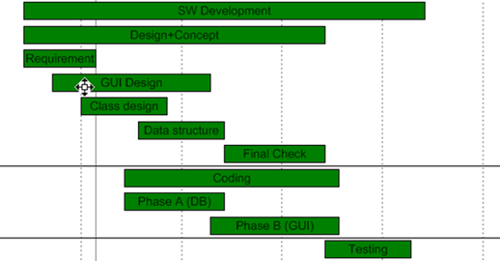
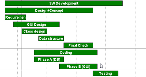
MAKE SURE THAT YOUR USERS CAN READ ALL TEXTS EASILY.
For example avoid using dark colors for texts, if they are placed in front of dark backgrounds. Contrast is king as contrast makes sure that your users can read what you want them to read. We are writing this blog post with black color on a white background. Not sure, why so many Gantt charts show dark texts on dark bars ...
A don't do. Low contrast:

Recommended. High contrast:

Tip 3: Use color gradients like chili—make it hot, but not unenjoyably
Honestly: Our Gantt chart control offers full horse-power to work with color gradients. Sometimes, we feel that this is a powerful feature but like chili. If you use it too much, the Gantt chart becomes really unenjoyably.
Please be careful with the usage of color gradients. Keep in mind that if many objects
inside a chart are colored by gradients it can result in an unclear look and distract from the main aspects of the chart. Also, keep in mind that your users are influenced by what is happening on their mobile devices: the current trend is flat tiled buttons and icons. Hence, only use color gradients in a very selective way.
If the gradient blends from light over dark and again back to light this gives the impression of a concave surface. In contrast, using gradients from dark over light to dark will result in a convex surface. Mostly it is the convex look which appears to be suitable.

Also: beware of unnatural looks. It is a daily user experience that objects are lighted from the top (think about the sunlight or the lighting in your office). Therefore, vertical gradients from dark to bright may appear in some way wrong or confusing. In any case do not mix both variants.

Tip 4: Row backgrounds guide the user’s eyes
Only few Gantt charts suffer from a lack of data ;-). The more data you have to display in a Gantt chart, the harder it gets for the user to relate the bar in the graphic part of the Gantt chart to the respective information in the table part. A good way to cope with this is to introduce alternating row background colors.
Alternating row background colors.

As an alternative, you can also define that only the rows of the selected nodes are dynamically colored. This is a standard feature of our Gantt chart controls.
Rows with selected nodes are automatically highlighted:

What kind of best practices do you apply when it comes to coloring your Gantt charts? Please share with us in the comments.
Want to also learn how you can use colors to define semantics of a Gantt chart? Interested in getting ideas how to use colors to provide intelligence to a Gantt chart? Download our FREE Ebook:

