“A picture is worth a thousand words” - this statement can by all means be applied to our graphical planning board add-ins that are the perfect choice when it comes to convincing potential customers of the added value of the ERP system in the pre-sales stage. They are intuitive-to-use, help making planning and resource data transparent, illustrate dependencies and allow a much more agile scheduling.
This blog post specifically aims at Microsoft Dynamics NAV partners and takes the Visual Service Scheduler as example for illustrating 4 important reasons why and how the graphical planning boards help to actively support the sales consultation and to underline the value of Microsoft Dynamics NAV.
# 1 The result as introduction
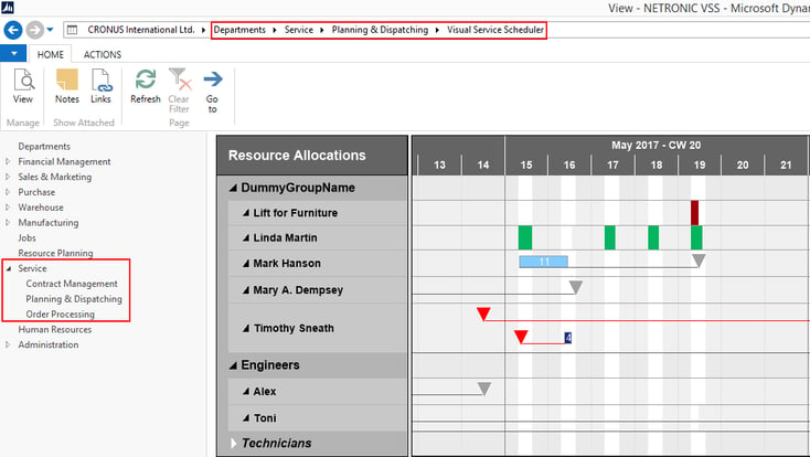
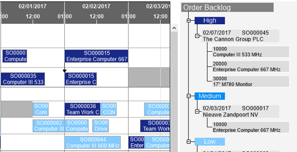
How can Dynamics NAV be presented to a potential customer? In a pre-sales demo, definitely a lot of clicks are necessary. Opening and closing of pages, lists and cards, switching between sections and modules – this constant clicking through data mainly represented in tables certainly bears the danger to confuse and also exhaust your prospect. Why not go the other way round and show him the result first? The VSS visualizes data from multiple tables and cards such as service orders, service item lines, resources, and resource allocations on one page. Hence, this one page represents the result of working and planning with Microsoft Dynamics NAV, thus helping prospects understand the value of working with the ERP system.
# 2 No abstract Dynamics NAV terminology
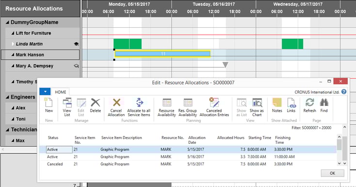
Moreover, the VSS that is completely integrated in Dynamics NAV, is a good way of illustrating NAV-specific terminology. Show the tooltip text or open the related NAV card from the visual (and thus: easy-to-understand) context of the scheduling add-in thus explaining terms like service order, service item line, or resource allocation vividly and in their particular context.
# 3 Simplify the complicated
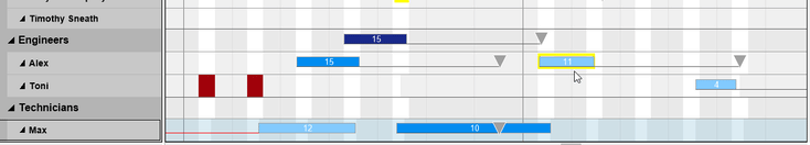
The chart shows several items of information as overview, thus supporting prospects to see where connections and dependencies are. That way, the process of service order scheduling with NAV gets illustrated quite vividly. Different view options like Histrogram, Tree & Gantt chart, or Two Gantt charts, establish different perspectives of the same NAV data.
- Show the details of your service orders without capacity information...
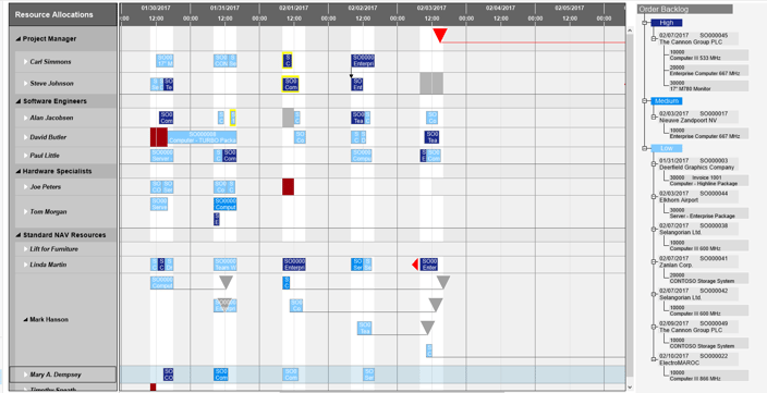
- ...or with histogram to manage the resource capacity
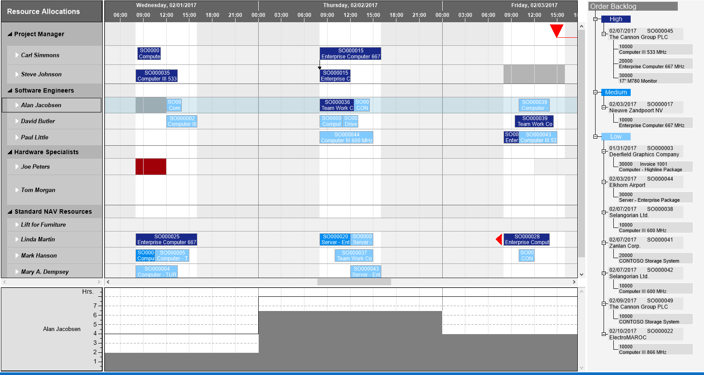
- See unassigned and assigned service orders at one glance
# 4 Manual modifications are possible
Many planners don’t want rigid planning specifications made by optimization algorithms. They want to see, control, and manually adjust the calculated planning. Assure your potential customer that he is not at the planning system’s mercy. Use drag and drop to show that it’s no problem to plan orders for an earlier date at short notice, reschedule resources or make other changes.
More information
- Webinar about Visual Scheduling made EASY for service organizations.
- Want to see the VSS in action being deployed at a customer's?
- Ebook about Visual Scheduling for Microsoft Dynamics NAV: