During the last years we gained a lot of experience in developing HTML5 Gantt charts. It boiled down to a generalized model for resource planning, that is now basis of our Visual Scheduling Widget. How this model looks like, I started to explain in my previous blog post, when I described the data model and its' different types of objects we think are relevant to visualize resources and their activities.
In this post I explain how to map the members of this data model to interactive graphical representations. So the second (and last 😉) part of my series of blog posts about our generalized model for HTML5 Gantt Charts refers to the concept of mapping.
#2 Our concept of mapping
Two views
Having a data model is nice, but what is needed in the end is an interactive chart that allows a user to work with that data in the most intuitive way possible. Therefore, an adequate representation for all members of the data model in form of a Gantt chart has to be found.
In practice, two types of charts have proven to be very useful and valuable:
- the Activities view and
- the Resources view.
One can imagine them as the two sides of the same coin. Both present the data model from a different perspective with different focus.
Extension of the pur data model for interactive representations
In order to be able to specify all desired aspects of the mapping of the data model to interactive, graphical representations, we added many additional properties to each object type of the data model. These properties – they are marked by the prefix “pm_”, which stands for “presentation model” – can be used to control the following aspects of the presentation:
- colors of graphical elements such as bars, table rows, lines, texts, timescale, calendar grids, …
- collapse status of rows/groups (expanded, collapsed)
- possible interactions (whether a bar can be moved or resized, whether a row can be collapsed or not, which elements are selectable, snapping targets, etc.)
- design of expanded and of collapsed rows (whether and how child elements should be displayed)
- visualization of special properties such as constraint dates, status, symbols, etc.
Many of these properties can be set both as default values and as individual values for individual objects. For further details, please refer to the Interface Definition Document – IDD for short – of the respective widget.
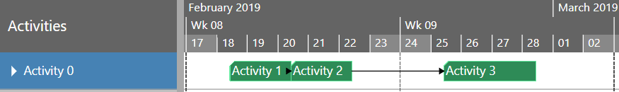
Activity view
In this view, activities are listed in the table area of the Gantt chart. In the simplest case, each activity has its own row. In the diagram area, the start and end dates of the activities are represented by bars. Resources and allocations are not of interest in this view type.
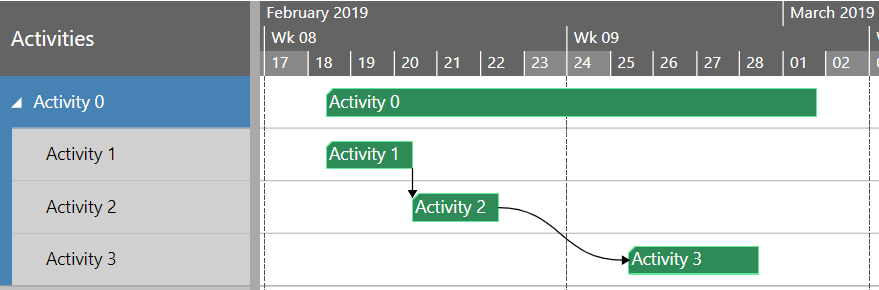
If activities are grouped, then the parent activities can be expanded:
Or the parent activity can be interactively collapsed:
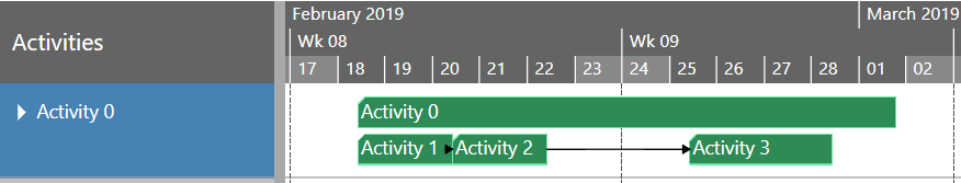
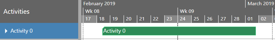
In the collapsed state, the parent activity itself and all child activities are positioned in one row. But this is only one possible way we provide to display collapsed rows. Alternatively, you can choose a different design and decide to show the parent activity only:
Or instead of the parent only the children are to be seen:
In any case, the concrete design for collapsed activities can be defined individually for each activity as well as globally by default settings.
Link objects are mapped to arrows between activity bars. The relation type of a link is expressed by the layout of the arrow, which can begin and end at the beginning or the end of a bar depending on the type.
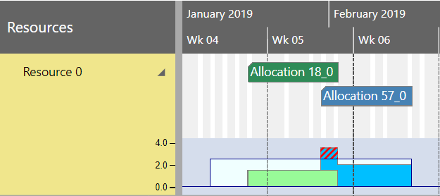
Resource view
Analogous to the activities view, the resources view lists all resources in the table area of the Gantt chart. In the diagram area the allocations and their entries are displayed. The calendar entries for non-working times of a resource are visualized by slightly grayed vertical strips.
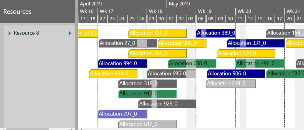
There are multiple designs for visualizing allocations.
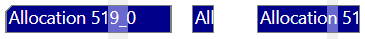
- An allocation can be represented by a single bar:

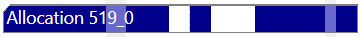
- If it has more than only one entry, then each entry can be displayed as a separate bar:
- Or the entries are shown together with the allocation itself:
For displaying curves there is a curve area inside each resource row, which can be interactively expanded and collapsed.
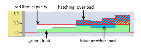
A curve object is displayed as a stepped line, possibly with the colored area below the line. Each curve entry defines a data point of that stepped line.
With stacked curves, not only the stack as a whole is visible, but also the single members of the curve stack.
The following figure shows two curve objects, each of them representing the load of a resource caused by an allocation. They are stacked on top of each other and visually distinguishable by two colors. An additional curve object defines the capacity of the resource and is displayed by a line. The area where the stacked curve exceeds the capacity line is highlighted by hatching:
Of course, this is only one possible sample for the use of curves. A lot of further applications for curves are conceivable and you can use curves to express any other semantics.
Last but not least, there is an additional view type – the Loads view – that is a derivate of the resources view with the curve diagram areas only and without any bars. It is a valuable tool when only the capacities and loads of the resources are of interest, but not the allocations in detail.
Entities Table
The entities objects are displayed in a special table – the entities table – that can be displayed on the right side of the Gantt chart.
Next steps
The generalized model for resource planning is universal enough to map most resource planning models from practice to powerful interactive HTML5 Gantt charts. So understanding the model you can see the potential of our Visual Scheduling Widget for your scheduling solution. You will get a tool that allows you to design in a very easy way the perfect planning board tailored exactely to the business logic of your application. Feel free to contact us in case of any further question.
Free e-book
We put both blog posts (#1 data model & #2 concept of mapping) in one e-book 👍.
NEW: We have updated our model in December 2019. Please read blog post here.
Here is the free updated e-book download.