Typically, people who work on large projects or in production scheduling are far away from loving Gantt charts. They are tasked to build them, to update them, to report on them, and to maintain them even when the reality has turned out to be different than the originally layed out Gantt diagram.
 Guess what? I could not agree more with all of these peoples' complaints. Surprised? – Here is why: all these issues have nothing to do with the visualization itself. With such complaints, people do not dare having a closer look into the Gantt chart's visualization capabilities. They always relate to information gathering processes, management methodologies and reporting tasks. But folks, do not blame the diagram for the way it is used. This does not make any sense at all to me.
If the process of maintaining a planning and scheduling diagram sucks, why not trying to make them become meaningful to people? Why not figuring out charts that provide the appropriate data and information, which people need to better make their jobs? Here are six tips how to achieve this.
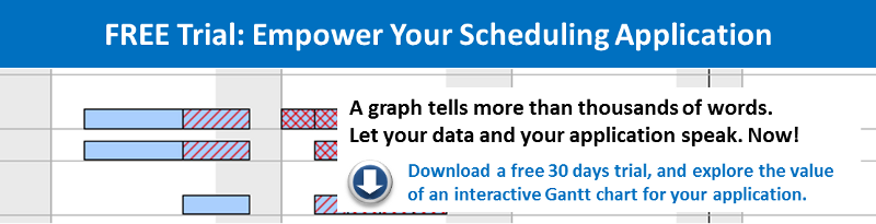
Tip 1: An image says more than 1,000 words. Let dynamic colors speak.
Many Gantt charts just look boring and meaningless. However, nobody explicitly ever had forbidden to use colors for the bars. Why not letting the colors of the bars speak? For example, if your activities have a different status (like planned, released, in progress, finished, delayed), chose this to determine the bar color. E.g. show released activities green and delayed activities red. If these status information come from a database, you can even think of working with dynamic colors e.g. automatically change the color of an activity when the status changes. That way, the user of the diagram will automatically know where to focus his attention first. Make colors dynamic and let them speak!
Tip 2: Stop believing "one activity = one bar in the Gantt chart".
 The general idea of the Gantt chart is as smart as easy. However, easy does not necessarily need to mean simple or stupid. Of course, the initial idea of Henry Gantt was to have one bar for one activity. But why not thinking of this bar more as the "information container" related to this activity? For example: You have the bar that shows the range from planned start to planned finish date. Now that the operation starts, you have an actual start and a corresponding expected finish date. If you put this as layer on top of the initial bar, you can easily compare actual and plan. The next obvious thing to do is adding another layer that shows the percentage of complete so that you can better assess a potential plan/actual difference. Of course, there is room for more layers and more information. You just need to imagine the possibilities...
Tip 3: Combine tip 1 and 2 and work with dynamic layers.
 Let's mix the ideas of working with dynamic colors and of using multiple layers per activity. Why not introducing dynamic layers? Layers that speak by themselves and that give users immediate visual alerts? E.g. assume that you move an operation in the diagram and create a conflict with another operation (that may not be visible on the screen at that peculiar moment). A simple red layer beneath both operations' bars could indicate the conflict, and immediately alert the Gantt chart user. Think of dynamic layers and how they can make the difference to your Gantt chart.
Tip 4: Introducing top-down views to your Gantt chart.

Sometimes when looking at Gantt charts, I struggle finding the wood for all the trees. Many people tend to load many data into a Gantt chart. I have seen charts with almost 100,000 of bars. No wonder that people do not like this ;-)
However, nobody ever said that you can only work with one Gantt on a screen. Think of the following scenario: a production environment, in which each order has to get processed at four different work centers, and every work center consisting of multiple machines. In such an environment, I could image having a "split screen" with a high level Gantt chart on the top of the screen. This chart then would only show the sequence of all the orders and no further details. The lower Gantt chart could then provide a detail view in such a form that clicking on one operation above would show all the related activities below. With all the details: lead time, run time and transportation time for each work center. This would help seeing the forest, while still being able to look at all the single trees and their specialties.
Tip 5: Combine tip 3 and 4: top-down views with dynamic layers.
Imagine that you change something on a lower level in the Gantt chart which creates a conflict. A dynamic layer related to the just changed activity then indicates this conflict. Well, if you do this, why shouldn't you populate this information upwards so that it is also shown in the high-level views? If you work e.g with deeply structured data hierarchies, you could think of having a group summary bar that would always indicate if and when a conflict occurs in the below group/activities.
Tip 6: Stop using Gantt charts for one-way reporting! Empower your people.
By all means: stop using Gantt charts only for weekly status report or status meeting purposes, in which information only flows one way: from the employee to the manager. Let your people work with the Gantt charts by making Gantt charts interactive. Enable people to visually change elements on the Gantt chart, move or re-schedule jobs and operations. Gantt charts have the potential to empower your people to better schedule their day-to-day operations, and to react faster. Interactive Gantt charts will make them control the process, and hence they will communicate the findings derived from using the Gantt rather than just complying with a reporting requirement.
To put this in a nutshell: I strongly recommend stopping to focus on the process of making a Gantt chart. Start thinking of how you need to "pimp" your Gantt charts so that your people start loving it. I shared some ideas with you. What are yours?