
The modern look & feel of Gantt charts not only helps gaining user acceptance. A well-thought-out design also yields intuitiveness and user friendliness. So, when developing a Gantt chart one should not only keep an eye on functionality but on design as well.
Of course, every Gantt chart has to meet its own planning requirements and hence has to have its own look. Even though, there are some basic design considerations a developer should keep in mind when developing a Gantt chart.
The second part of our blog series about the best design for user-friendly Gantt charts introduces three more tips for creating modern charts. The first three tips described in the last blog were about bar appearance. The next three tips deal with the complete graphic area, including time scale, table and Gantt graph.
1. Unity of Table Header and Timescale
You should design your Gantt chart in such a way that it appears as a visual unity. One important instrument for this is merging table header and timescale by using the same color scheme for both of them. For instance you can use dark, quiet colors like grey or blue for the background and white for the texts and timescale ticks.

2. Neutral Background in the Gantt Area
A Gantt chart, due to containing a lot of information, is a real challenge for the eye: bars, symbols, visual alerts, grids, date lines, indentations for indicating grouping levels etc. So be sure to choose a neutral - white - background for the Gantt area.
I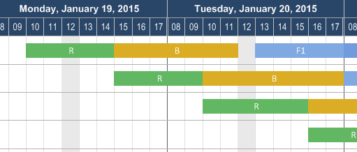
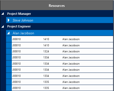
3. Color Shades in Groups
In practice, many Gantt charts visualize a grouping structure. For example, operations are grouped by production orders or tasks are grouped by the resources they are assigned to. The visualization of groups benefit from color shades by letting the planner recognize subgroups faster. "From dark to bright" is the rule. Use a dark background for the top level (often with white font color as well) and for the bottom level white with grey font color. You should also create "angles" in the table area with the help of the color scheme in order to visualize the dimensions and structure of the subgroups.
There's one more advantage to this graded visualization of groups: When scrolling vertically, the user always sees to which grouping level the visible rows belong even if there are many subgroups.
We will soon publish the last part of our blog series about design tips for user-friendly Gantt Charts. It will deal among others with the question of where to best place additional information in the Gantt chart.
If you are developing a Gantt application, you are welcome to test our design tips with our Gantt component VARCHART XGantt.

If you are not sure whether the design of your Gantt application is user-friendly, modern and intuitive, feel free to contact us and show us your application. We'd love to give you free advise on how to make your Gantt chart more attractive to the user.

For your reference: all post blogs from this series:
Post 1: Bar design
Post 2: Timescale, table and Gantt graph
Post 3: Where to best place additional information