When using a Gantt chart in any kind of scheduling application, users typically are not interested in seeing all data. They want to focus only on the relevant data. That means they want to focus on those jobs, production orders or tasks which are crucial and which require corrective actions. Hence, software developers creating Gantt chart applications should look out for Gantt chart software components which provide capabilities to create visual alerts.
E.g., if you are using a Gantt chart for controlling purposes, then you might be typically interested in having a clear and precise overview of the current situation. Especially in cases when something seems to get out of control you need to see the issue immediately.
Visual alert in Gantt chart: red layer marks critical operation
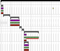
 Let’s assume you have a Gantt chart displaying nodes which are grouped by resources and each node is representing an operation of a production order. Now it could be that one operation is too late and therefore the corresponding order will not be finished in time. The question is: How can you visualize an alert in such a way that it is easy to notice the risk and to find the operation responsible for the delay?
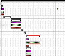
A first approach could be as follows: If an operation is too late, an additional red layer is displayed to warn about the delay.
The drawback of this solution is that you have to scroll a lot horizontally and vertically, if the chart consists of many rows and if the chart spans a wide time period. And in case of collapsed groups no alert layer is to be seen at all. So, in a next step you could add an additional red layer at the grouping level on top of the gray summary bar.
 Moving the visual alert upwards
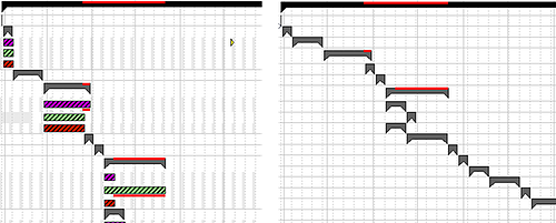
In the same way you could mark a delay by red alert layers at each upper grouping level. In this manner the warning is pushed up to the highest grouping level. That way, you make sure that you see all bottom-up alerts also in your top-down view.
Pushing the visual alert to the highest information level
In the same way you could mark a delay by red alert layers at each upper grouping level. In this manner the warning is pushed up to the highest grouping level. That way, you make sure that you see all bottom-up alerts also in your top-down view.
In the left screenshot, you see that all delays are pushed to the upper grouping levels up to the highest level. In this example, the black summary bar at the top summarizes all delays in one single layer spreading the whole critical area. Even in case of all groups collapsed, the alerts are easy to be noticed (right screenshot).

Are you developing a scheduling application and consider using a .NET Gantt chart component? Do your users expect visual alerts? Do you look for ideas how to make your Gantt chart take a compelling look?
We are happy to share some further ideas in our FREE Ebook. Download now and enjoy reading!


