Different spices not only have different tastes, but sometimes even more important: they play different roles for the meal. Some of them never get recognized when you eat the meal. However, you would definitively “miss something” if they would not be used. Other sorts of spices are very dominant for the meal and you immediately taste them with the first bite … or even smell them when the meal is served. Also, there are spices which are not that dominant, but still round up the taste experience.
Well, similar like spices can play a hidden, a dominant or a complementary role, there are also different functions that colors can take if you develop a Gantt chart in .NET or C#.
 We have found, that colors also can play three roles when developing a .NET Gantt chart … and that they have to play all three roles to make a Gantt chart meaningful to its users.
- Of course, the first role is that colors determine the appearance of the Gantt chart. That’s a no-brainer.
- Colors also can be used to define the semantics of a Gantt chart. As such, they help the users to faster understand the complete and often complex reality that a Gantt chart presents.
- Last but not least, colors can also provide intelligence to a Gantt chart and hence enable the users to make crucial decisions faster.
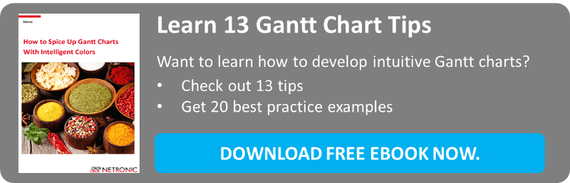
Based on these roles, we have developed 13 tips how software developers can create compelling Gantt charts by making use of intelligent colors with our Gantt chart software control. We have summarized these Gantt chart best practices here. If you want to learn more, we also provide more details in an in-depth Ebook with more than 20 best practice screenshots.
Tip 1: Useful tools to create beautiful Gantt charts
It goes without a saying that you should pay attention to achieve an esthetic look of your Gantt chart. This will definitively help increasing the user’s acceptance of your Gantt charts. Virtually nobody likes to work with something that he perceives as ugly. Please: make your Gantt charts beautiful! There are tools such as Color Scheme Designer or Adobe Kuler to support you.
Tip 2: Contrast is king
Although it seems trivial, we have seen many Gantt charts where we wished somebody would have remembered this triviality. MAKE SURE THAT YOUR USERS CAN READ ALL TEXTS EASILY.
Tip 3: Use color gradients like chili - make it hot, but not unenjoyable
Please be careful with the usage of color gradients. Keep in mind that if many objects inside a chart are colored by gradients it can result in an unclear look and distract from the main aspects of the chart. Also, keep in mind that your users are influenced by what is happening on their mobile devices: the current trend is flat tiled buttons and icons. Hence, only use color gradients in a very selective way.
Tip 4: Row backgrounds lead the user's eyes
The more data you have to display in a Gantt chart, the harder it gets for the user to relate the bar in the graphic part of the Gantt chart to the respective information in the table part. A good way to cope with this is to introduce alternating row background colors.
Tip 5: Do not try to overrule day-to-day semantics
Keep in mind that in our day-to-day life some colors are bound to a very distinct meaning. For example, think about traffic lights or control panels: red means alert, danger or stop. Nothing else.
Tip 6: Use same color for different semantics
You want to enable your users to comprehend the situation shown in the Gantt chart at one glance. A good means to achieve this is using the same colors for similar activities or for grouped objects.
Tip 7: The color hierarchy should represent the information hierarchy
Very often, we notice diagrams where colors tell a different story than the actual information in the Gantt chart tell. This feels like eating a desert for which the cook used salt instead of sugar. Make sure that your color hierarchy represents the information hierarchy.
Tip 8: The art of highlighting selected elements
Make sure that you do not overrule semantic colors by colors that you use to select codes. Work with semi-transparent layers instead.
Tip 9: Coloring of short and subsequent activities
When production orders or operations are very short (sometimes they only take a few minutes to complete), it gets hard to differentiate them in the Gantt chart. A proven best practice is to use different colors for the various production orders, and to not use a black border for the nodes. This helps to create a focus on the single operations and gives a clearer picture on what is happening on the various machines.
Tip 10: Work with bottom-up and top-down visual alerts
Work with visual alerts which are shown both at a high-level and at a detail-level view. This will help your users to identify the crucial tasks at one glance, and without a lot of scrolling.
Tip 11: Use context-sensitive node colors and layers
The purpose of a Gantt chart should not just be to visualize data, and especially not to visualize all data. However, this is a typical approach which we observe across the board. We believe that a Gantt chart should be built to support the users making business critical decisions faster. Hence, it is not only important to present all data to the user, but to direct the user’s focus to the decision-relevant information.
Tip 12: Apply user alerts to the Gantt chart table
As compelling as warning colors or warning layers are, they face one inherent weakness: they are only visible when the actual bar is visible on the screen. However, sometimes Gantt charts have to master the spread of providing a high level picture and delivering very detailed information. Hence, we highly recommend to include decision-relevant information such as delivery time commitments as indicator fields into the table part of the Gantt chart.
Tip 13: How to visualize the percentage of completion
Gantt charts always visualize time-related planning data. We regularly observe use cases, in which the percentage of completion of a specific job or task is an important information for the planer. A recommended best practice to visualize the percentage of completion is to add an “informational” layer on top of the task layer.