
To know at what time their resources are available is an essential information for every planner. So, the intelligent visualization of working and nonworking times in a Gantt chart is therefore a 'must-have' in every resource planning and scheduling application. In this blog post we give an insight how we use the calendar objects in our Visual Scheduling Widget (VSW) for HTML5 Gantt charts to visualize working and nonworking times and we will discuss how they are specified and applied. We also give a lot of tips and tricks for best user interactions,
Basics of the Visual Scheduling Widget Calendar Object
Calendars in the Visual Scheduling Widget are used to define the general availability of a resource without considering the specific capacities. Each calendar object has an array of calendar entries that determine whether it is a working or a nonworking time for a period specified by a start and an end date.
Here is a simple definition of a calendar that has defined two periods with working time (on January 4 from 6 am to 12 pm and from 2 pm to 6 pm):
widget.addCalendars([
   {
      ID: 'Calendar1',
      Entries: [
         {
            Start: new Date('2021-01-04T06:00:00'),
            End: new Date('2021-01-04T12:00:00')
         },
         {
            Start: new Date('2021-01-04T14:00:00'),
            End: new Date('2021-01-04T18:00:00')
         }
      ]
   }
]);
The default time type for a calendar object is “nonworking time” and for an entry “working time”. When defining the entries, you can additionally specify their time types. As an alternative to the sample above, you can also arrange the same situation as follows:
widget.addCalendars([
   {
      ID: 'Calendar1',
      Entries: [
         {
            Start: new Date('2021-01-04T06:00:00'),
            End: new Date('2021-01-04T18:00:00'),
            TimeType: netronic.nVSW.TimeType.WorkingTime
         },
         {
            Start: new Date('2021-01-04T12:00:00'),
            End: new Date('2021-01-04T14:00:00'),
            TimeType: netronic.nVSW.TimeType.NonWorkingTime
         }
      ]
   }
]);
A note about the format of the date strings used in this blog post: To make it easier for you to reproduce the examples and to get the same diagrams as you see here, we use the local date string format. But for your application, we recommend using the simplified ISO 8601 standard (see http://www.ecma-international.org/ecma-262/5.1/#sec-15.9.1.15 ) for defining the dates unambiguously. So, for instance, instead of writing '2021-01-04T06:00:00' it should be '2021-01-04T06:00:00Z'.
Starting point of calendar visualization in the Gantt chart
As long as no calendar is applied, the Gantt chart of the Visual Scheduling Widget is working with nonworking times only. This is for your security, as it forces you to define and apply an appropriate calendar object.
Without using a calendar, a Gantt chart might look like this:
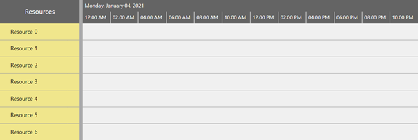
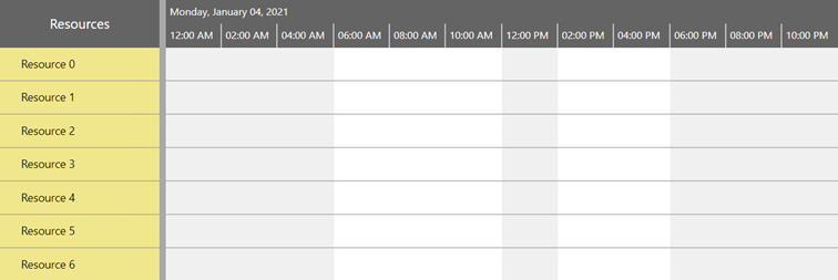
Here you see the resources view with a light gray background within the diagram area. This gray color indicates the nonworking time. Now we can assign the calendar to the Visual Scheduling Widget by using the option “defaultCalendarID”
widget.option("defaultCalendarID", "Calendar1");
and as you can see in the next figure, the gray background is now interrupted by two white stripes that indicate the working times:
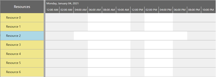
For full flexibility, each resource can of course have its own calendar assigned. Therefore, you can define another calendar and assign that to a resource. This new calendar will override the settings of the default calendar:
widget.addCalendars([
   {
      ID: 'Calendar2',
      Entries: [
         {
            Start: new Date('2021-01-04T04:00:00'),
            End: new Date('2021-01-04T20:00:00')
         }
      ]
   }
]);

widget.updateResources([
   {
      "ID": "R2",
      "TableText": "Resource 2",
      "PM_TableColor": "lightblue",
      "CalendarID": "Calendar2"
   }
]);
This leads us to a chart where the calendar grid of Resource 2 is different from those of the other resources:
Best practice of visualization
Besides coloring the chart background, there are further impacts that a calendar has on a Gantt chart:
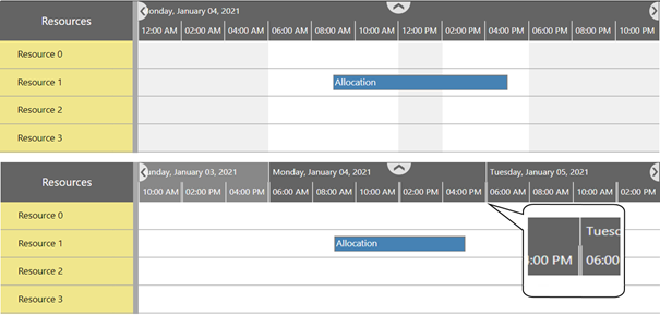
First, the calendar information can be used to indicate the nonworking times inside the bars. You can let the widget calculate the colors for these times automatically depending on the regular bar color, or alternatively you can explicitly specify a color of your choice.
For instance, let us have a look at an allocation of resource 1:
widget.addAllocations([
   {
      "ID": "All1",
      "ResourceID": R1
      "BarText": "Allocation",
      "PM_Color": "steelblue"
   }
]);

Adding the allocation property "PM_NonworkingTimeColor": "calculated":

Or alternatively set the property "PM_NonworkingTimeColor": "tomato"

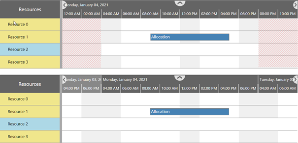
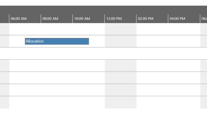
Another interesting aspect of using calendars is the possibility to visually collapse nonworking times by setting the widget option "nonWorkingTimeVisible" to false. This is a valuable feature to reduce the space the display will take in the horizontal direction. This way you can overview a larger period of time at a glance as you can see in the following comparison. The upper figure shows a chart with all nonworking times visible, whereas the lower figure all nonworking times of all resources are collapsed. Inside the timescale, the missing times are indicated by double lines (see the magnified extract).
Note: Things become a bit more complex if the resources do not share the same nonworking times. Only those nonworking times that are common to all resources can be collapsed. In the following example the calendar of Resource 2 prevents that all nonworking times are collapsed. For clarification, the collapsible times are shaded in red:
Best practice of user interactions
Another impact of calendars is that the calendar information is respected when the user moves a bar. In this case the phantom bar that is displayed during the interaction becomes longer or shorter, depending on whether the bar passes nonworking times or not.
There is also an impact on the user interactions if working with snapping targets (see activity and allocation properties “PM_SnapTargetsForStart” and “PM_SnapTargetsForEnd”). In this case, calendar grids can be used as targets. This makes it easy for the user, for example, to interactively position the start of a bar exactly at the beginning of a work period.
Watch our video about working and nonworking times
Specifics of the Activities View
In the activities view, calendars are handled slightly differently compared to the resources view (read here more about the two different views). Here, by default, no calendar grid is displayed. To display any calendar grid in this view you have to set the widget option “pm_activityCalendarsEnabled” to true. Then you will see the default calendar as well as calendars that are assigned to individual activities.
Differentiation between Calendars and Period Highlighters
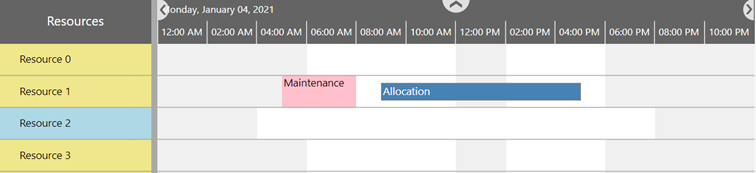
Finally, let me say a few words about period highlighters and the difference to calendars. Unlike a calendar, a period highlighter is just a graphical element that allows you to visually highlight a certain period. It has no effect at all on user interaction and it is not considered in any calculation processes.
As with all of object types of the Visual Scheduling Widget, you can simply add period highlighter objects by using the corresponding add method:
widget.addPeriodHighlighters([
  {
    ID: 'PH1',
    Entries: [
     {
       Start: new Date('2021-01-04T05:00:00'),
       End: new Date('2021-01-04T08:00:00'),
       Color: 'pink',
       Caption: 'Maintenance',
       CaptionColor: 'black'
     }
    ]
   }
]);
Now you can assign the highlighter to a resource (or even an activity) by using the property “PM_PeriodHighlighterID”:
Next step
Interested in learning more about the versatile functions our Visual Scheduling Widget offers? Why not start with our Hello Gantt World video that shows you how to build your first HTML5/JavaScript Gantt Chart within 6 minutes.
And if you want to test the widget immediately - here is a free download:
