We have been developing Gantt chart software for more than 20 years. When working with customers, we often discuss issues like performance, grouping, sorting and filtering, data binding, drag & drop interactions, linking of tasks, printing and other typical Gantt diagram features with them. What is often overlooked is the impact that colors can have for a scheduling application. Colors seem so trivial, that they are only rarely discussed. With this blog post we share five best practices how to use colors to define the semantics of your planning diagram.
Tip 1: Do not try to overrule day-to-day semantics
 Let’s start with something obvious. Keep in mind that in our day-to-day life some colors are bound to a very distinct meaning. For example, think about traffic lights or control panels.
- Red usually means alert, danger or stop.
- Yellow stands for warning.
- Green indicates OK, go ahead.
Tip 2: Use same colors for similar activities
You want to enable your users to comprehend the situation shown in the Gantt diagram at one glance. A good means to achieve this is using the same colors for similar activities or for grouped objects.
For example, to display grouped tasks use the same color tint for all bars of each group and for the corresponding table area as well.
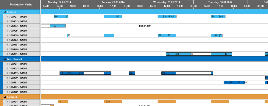
Tip 3: The color hierarchy should represent the information hierarchy
Very often, we notice diagrams where colors tell a different story than the actual information in the Gantt chart tell. This feels like eating a desert for which the cook used salt instead of sugar. Make sure that your color hierarchy represents the information hierarchy. Don’t guide your users’ attention to the less important things by using bold colors for them.
The following screenshots explain this more detailed using the example of calendar grids.

Tip 4: The art of highlighting selected elements
Colors are also used to highlight elements like nodes or table rows in a Gantt chart to mark them as “current” or “active” elements. This selection then is relevant e.g. for the next user interaction such as deleting all marked nodes. In that case, it is more than helpful for the user if all selected elements are marked identically. This can be achieved by using a noticeable color to attract the users’ attention.
You can achieve this by defining a new layer which is bound to a filter and which will be displayed only when the filter condition applies.
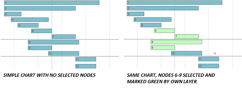
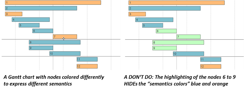
However, in almost any case, a Gantt diagram is not as simple as above. Typically, the elements to be marked have own colors to express specific semantics. Then the marking color would hide the “semantics color”. Hence the user might lose important information about the marked elements.
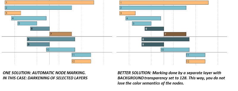
In such a case we recommend to darken or to brighten the selected elements. Our VARCHART XGantt control offers a simple way to do so on its property page (see the “Nodes” tab, “marking types for nodes”). In this case you do not need to define a layer only for highlighting purposes.
Please note: the default darkening and brightening of VARCHART XGantt is fixed to 25% of the original color lightness. As you seen from the bellow (left) screenshot, this approach can result in diagrams where the semantics of the marked elements are preserved, but where the marking is no longer clearly visible.
The solution then is to use an own layer for marking. In the following example, we used a black layer with the alpha value (transparency) set to 128. In addition, we changed the font color from dark gray to white. This increases the contrast and thus improves the readability.
Tip 5: Coloring of short and subsequent activities
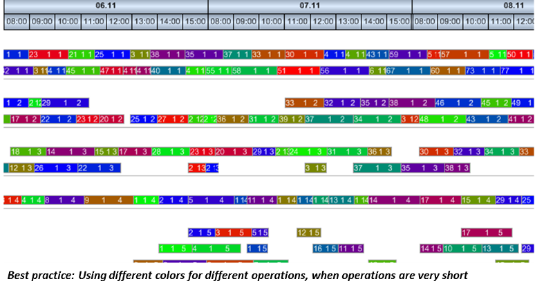
In these days, we often observe that many activities (sometimes thousands, or even ten thousands) are shown in a Gantt diagram. This is regularly the case in a manufacturing environment, where users typically need a “machine view” that shows how busy a machine is during a given timeframe. When production orders or operations are very short (sometimes they only take a few minutes to complete), it gets hard to differentiate them.
A proven best practice is to use different colors for the various production orders, and to not use a black border for the nodes. This helps to create a focus on the single operations and gives a clearer picture on what is happening on the various machines.
Do you have similar best practices which you apply when it comes to coloring your Gantt diagrams? Please share with us in the comments.
Want to get more tips & tricks how to spice up your Gantt scheduling applications? Download our FREE Ebook:

