Some months ago I supplied you with a blog series summarizing our experiences with developing a JavaScript/ HTML5 "viewer" for NETRONIC’s Visual Production Scheduler. Based on Microsoft Dynamics NAV add-in technology we built a JavaScript Gantt chart add-in, which can be used with the Windows Client as well as with the Web Client of Dynamics NAV 2013 R2 and 2015. Although we were quite happy that we were able to offer such a Gantt chart very shortly after the launch of the JavaScript control add-in technology in Dynamics NAV, we did not lean back. Instead, we reworked the architecture of our JavaScript control add-in to further optimize the performance (especially in a browser-based environment) and to enable also some new functionalities. With this blog post, we again share the lessons learned.
1. Redesign of architecture to further increase performance
As I mentioned earlier, we made some “real-life data stress tests” with the Gantt chart add-in integrated into Dynamics NAV 2013 R2. No surprise: when dealing with huge data sets, the load performance as well as the “painting performance” already revealed some room for improvement. The same applied to switching between the different views – production order view and capacity view – which took some time in a browser-based environment. Therefore, we evaluated options to accelerate the control add-in.
Of course, data virtualization can be a good and effective way to reduce the time needed for loading data. It means that only those data are loaded that are strongly required for the current visible view. All the rest of the data will be loaded on demand, for instance if the user scrolls a chart vertically and new production orders have to be shown. But things will get difficult as soon as there are relations between the data visible in the current view and the data not yet loaded. How can we, for example, display graphic links between a visible and an invisible entity? How to determine the right direction of such a link? And what will be the effect when scrolling quickly? Will we get into new performance trouble because missing data has to be reloaded? Due to all those questions, we decided to put this approach on hold until one of the next releases.
So far, the entire Gantt diagram had been realized by a deep hierarchy of <div> elements in which the web browser was responsible for calculating the layout. In addition, a large set of cascading style sheets had to be treated. Altogether, the fact that the browser had to handle so many <div> elements led to a time-consuming layout process.
UI virtualization in the sense of reusing graphic elements can reduce the number of elements, but that was also no way out for us. We had already applied that technique without achieving the ambitious results we were aiming at. For instance, when scrolling the chart horizontally, we reused all those elements needed for displaying the timescale – i.e. major and minor ticks, labels, and separation lines. Table rows were dealt with in the same way in case of vertically scrolling the chart. But nevertheless, the number of graphic objects that had to be laid out by the web browser remained too large.
So, at the end we decided to redesign the entire architecture of the JavaScript control add-in for Dynamics NAV from scratch and to leave the <div> approach.
Apart from using <div> elements there are two further possible ways for generating complex graphics like Gantt charts: <canvas> and <svg> elements. Very soon, we discarded the first approach, mainly due to the restricted coordinate system of <canvas> elements. But the latter one turned out to be the right one for our goals. Instead of letting the web browser layout the <div> elements, we ourselves are now responsible for calculating the correct layout. That enables us to do it in a very efficient way because we can focus on the specific needs of our graphics.
In that course moving from <div> to <svg>, the most important change came with our decision to use the D3.js JavaScript library. It is a powerful library, which allows data visualizations by following a data-driven approach to DOM manipulation. Instead of creating HTML elements manually, D3 generates them by automatic transformations based on the data. Now we create arrays of uniform data and let D3 generate the visualization. For example, to display a timescale we create an array of simple cell objects. Each cell object specifies only logical properties of a cell like the date it should display. The cell object does not specify the concrete appearance of the cell. Based on the logical properties D3 will render all cells of the timescale.
To sum up, our new D3/SVG approach decreases the load performance by more than 90%. In the same way the time for switching between the different views decreased considerably.
Another very interesting effect of the performance enhancement is a simplification of the user interface. Surprised? The explanation is quite easy! With the old VPS Web Viewer we had to reduce the number of <div> elements to gain performance. Besides UI virtualization, we achieved that goal by forcing the user to reduce the visible time period using date/time pickers. Note, a wide time range means for example to have a lot of ticks in the timescale; a small range means having only few ticks. In the same way the number of calendar grid lines depends on the selected range. So, when stretching the timescale the user had to use the pickers to reduce the visible time range. Now due to the higher performance those pickers are unnecessary. We could eliminate them without getting into trouble.
2. Animations – the difference between oops! and wow!
Another interesting aspect of our new architecture with improved performance is the fact that we are now able to provide you with more sophisticated animations. And the usage of transitions of the D3.js library makes the realization of animations easy.
You believe animations are not really needed? Only gimmicks to blind the user? Useless stuff or simply a fad? Sorry, but our experience is a complete different one. Especially with regard to interactive, graphical applications animations gain in importance. For instance, imagine you want to collapse a group of rows in a table. Without animation the chart suddenly alters and it is difficult for the user to quickly realize what had happened. In contrast, if the height of each collapsing row is smoothly decreased, the user gets a clear impression of what is going on.
But not only user interactions may cause a chart to alter. Also changing data necessitates a chart to adapt. And please note, the larger the amount of data (keyword: big data) and the more extensive the changes, the harder it is for the user to comprehend the graphical changes.
In short, animations avoid the user being taken by surprise while he is interacting with a chart. Every time major alterations of the graphics occur, animations allow the user to follow them in an intuitive way. That is why we consider animations not as a gimmick but as a very valuable enhancement of our VPS Web Client. Animations make the difference between an “Oops!” and a “Wow!” experience.
If you want to enrich your application by animations, please keep the following aspects in mind:
- Use animations only to visualize relevant changes. This includes changing data or changing views (e.g. expanding/collapsing graphic elements). An animation should visualize a semantic transformation.
- Do not use unnecessary or senseless animations. For instance, rotating and flying tooltips might be fascinating but they will not really enhance the user experience.
- Take care of the right speed. If the animation is too fast, the user will be surprised. On the other hand, an animation that is too slow will annoy the user. If the animation consists of moving elements, keep the movement smooth.
- Ensure that the animation looks natural and consistent. For example, if you want a group of elements to disappear, all elements should use the same effect: each element fades out, or each element decreases its height, or each element moves out of the view. If possible, do not merge different effects.
- Keep in mind that animations are not only restricted to movements. Of course you can also use them to alter colors dynamically or to realize fading effects.
3. Enhanced functionality
The improvement of performance was the most important step for enhancing the functionality of the VPS Web Client. To give the user a helpful, graphical tool for scheduling and controlling the production we need more than simply visualizing the orders and capacities. We need to give the user an overview of the capacity loads, we need to warn him about overloads, and we need to help him to navigate through all the data fast, easily and in an intuitive way.
To achieve that aim our intention was to integrate curve charts for all capacities into the Gantt diagram. They clearly show the loads as well as the overloads of each corresponding capacity. But as you can imagine this approach leads to a further increase of the number of graphic elements to be laid out. And for this reason it was absolutely essential to gain performance. Otherwise, our vision could not have been realized.
Last but not least, another benefit of the redesign was the usage of <svg> elements. Following this approach makes the drawing of curves evidently easier.
In the following, I would like to introduce the most important new features to you.
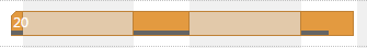
Detecting overloads: the load curves
If you are faced with a large chart containing lots of capacities (formerly named “resources”) it is difficult to quickly detect overloads. Hence, we were looking for an intelligent way to do this job efficiently.
In the table you will find a little circle to the right side of each capacity (work or machine center). By clicking it the load curve of the corresponding capacity will appear and the circle is filled. Clicking the circle once again lets the load curve disappear.
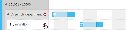
The color of a circle indicates whether the corresponding capacity has any overload (red) or not (black).
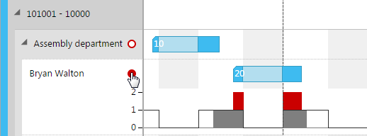
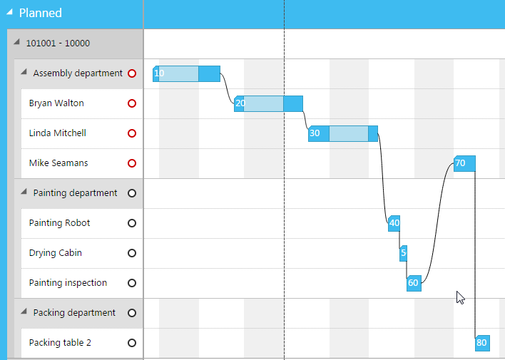
There is, however, a peculiarity you should be aware of. Let us assume a situation as follows:
The work center itself has no overload (black circle) but some of its machine centers have. Now, after having collapsed the work center its circle alters from black to red although it has no overload of its own:

The reason for this is the circle of a collapsed work center serving as an indicator for one of its machine centers being overloaded. In addition, you can also see pale red (not dark red) rectangles in the time area. In contrast to the load curves, they do not indicate the quantities of overloads but only that there is an overload.
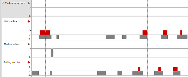
Capacities at a glance: the loads view
To reach an improved overview of all capacities (resources) we have added another view: the Loads View. This view is similar to the Capacities View but it focuses solely on the loads of all capacities. There are no operations to be seen and the load curves are always visible and cannot be switched off:
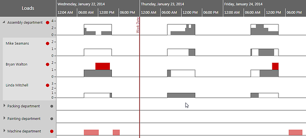
As with the Capacities View red and dark gray circles inside the table area indicate whether a capacity has been overloaded or not. This makes it easy for a user to find critical, overloaded capacities at a glance.
How to see further details
We improved the tooltips to give you a deeper insight into the details of the different diagram elements. You can show data details of a production order by moving the mouse onto its number in the table:
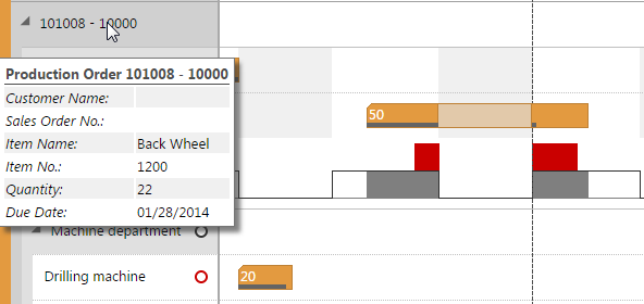
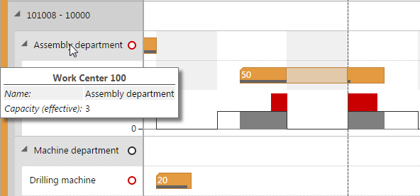
The same applies to work and machine centers. In the same way, when moving the mouse over an operation in the diagram or over a load curve a tooltip with more details will be displayed:
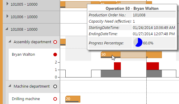
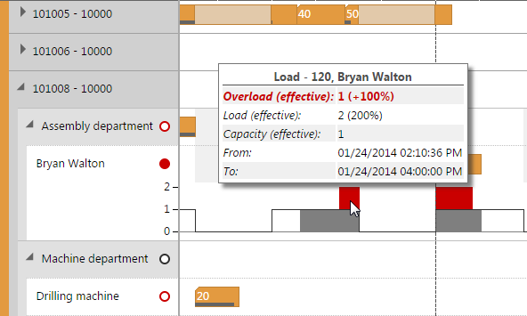
In addition to the tooltips the bars of operations belonging to released production orders may display a small dark gray bar at the bottom:
This bar represents the progress of an operation.
Displaying links
Typically, a production order consists of a series of consecutive operations and sometimes they are even related by a net structure. In any case, displaying all links at once will lead to unmanageable charts where the user will lose track of the relations. This is why we decided to show links of only one production order at the same time. The links between operations can be displayed by left-clicking onto an operation. Clicking onto the empty space of the time area lets the links disappear.
4. Touch me!
As of Dynamics NAV 2015 there is a third client available in addition to the Windows and the Web Client: the Tablet Client. Regarding the look and feel, this new client differs totally from the old ones. While the Windows and the Web Client have nearly the same look and feel, the Tablet Client has been redesigned to give the user the optimum user experience on touch-enabled mobile devices.
Of course, we are committed to support touch-enabled devices as soon as possible. But as you can imagine, for reaching an optimum solution a redesign of the entire user interface would be essential - and we would have to work on a variety of solutions always providing the device-specific native user experience. Hence, we decided to continue with our JavaScript/ HTML5 approach by first delivering touch-enabled, and then later on touch-optimized control add-ins. Our approach is to widen the regions sensible for touching, so that it will be easier to interact with the chart by using fingers instead of a mouse pointer. We will give you a deeper insight into the technical challenges with a future blog post.
5. To be continued…
I am sure you are now wondering what is going to come next. Well, we think that JavaScript control add-ins in Dynamics NAV are a great concept. To have the chance of building a control add-in once and using it in the Windows Client of Dynamics NAV and the Web Client and in the new Tablet Client is really compelling. And to some extent it is natural for us as a manufacturer of graphics software components to follow that technology straightly. Hence, we will refine the architecture of the VPS Web Client by separating parts of common interest so that we can use them to redesign the other of our add-ins – for instance the Visual Job Scheduler – as JavaScript control add-ins.
Another major step will be to add editing capability to the VPS Web Client so that it will become a valuable editor similar to our current Visual Production Scheduler. We are just working on that issue and we will keep you up-to-date and as soon as we have reached this important goal.