
When developing a Gantt chart, a key concern always is to provide all needed drag & drop scheduling functionality, of course. However, a proper UI design also matters since it not only underlines the chart's functions but is also essential for a good user acceptance and vital for user-friendliness.
In this series of blog posts with Gantt chart tips we discuss 9 design tips for user-friendly Gantt charts that aim at supporting the development of modern, visually appealing and meaningful Gantt charts. The first part of this series will give you some valuable tips on bar design.
Of course, people have different tastes and opinions when colors, layer shape, table design etc. are concerned. Also, a seamless look and feel in the context of the overall application should be kept in mind when choosing the appropriate design for the Gantt. For this reason, our Gantt chart tips should not so much be seen as a must but more as some 'food-for-thought'.
#1 Adaption to Modern UI
As of Windows 8 the Modern UI (formerly Metro) has an important influence not only on the design of desktop or mobile applications but also on the design of web pages, for instance. The main striking element of Modern UI is the usage of flat, monochrome rectangles (tiles) instead of 3D shapes filled by color gradients.
To translate this design concept to your Gantt chart:
- Use monochrome rectangles for bars
- Don't use frames for bars. Of course there are situations in which adding borders to bars could make sense, e.g., if they follow each other closely. In this case do not color them black but use the bar background color and tone it slightly so that the layer won't look like a block.
- Labels are more and more done in white. If you want to follow this trend, you have to make sure that white ciphers are clearly discernible when choosing the background color. If you prefer black fonts, go for a dark grey instead since softened font colors are more comfortable for the eyes.
- Use the same principles for the timescale and the table area.
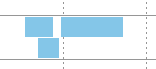
#2 Bent Layer Edges
If operations are positioned closely behind each other, a flattended top left corner will help to discern them. In the picture below the bent corner complements a bar that has a border as well. So the single bars can be recognized pretty easily.

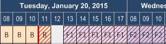
#3 Careful Usage of Hatches
Hatched bars in a Gantt chart create a very turbulent impression and therefore should be used only very sparingly. There are, however, cases in which two different information are to be shown on one surface. The sample below shows a bar the color of which can't change in dependency of exceeding a due date because the layer color also provides important information and so using a hatch would be ideal.
The bars above are developed with our winform Gantt chart controls VARCHART XGantt.
The next blog of the series on Gantt chart tips how to design your Gantt will be -amongst others- about giving an appealing look to groups.
By the way: a crucial part of any UI are colors. In a Gantt chart, they can have different functions. They, of course, determine the appearance, but they also can help define the semantics and can provide intelligence to the chart. Want to learn more about the impact of colors on your Gantt scheduling application? Download the complementary ebook How to spice up Gantt charts with intelligent colors.
For your reference: all post blogs from this series:
Post 1: Bar design
Post 2: Timescale, table and Gantt graph
Post 3: Where to best place additional information