When discussing requirements for a scheduling or planning application our customers typically adress issues like: performance, grouping, sorting and filtering, data binding, drag & drop interactions, linking of tasks, and printing. What is often overlooked is the impact that colors can have for a such an application. Colors seem so trivial, that they are only rarely discussed. However, our experience from dealing with Gantt diagrams for more than 20 years tells us that colors are the spices for your Gantt charts. In this blog post you can learn how colors can help establishing visual intelligence.
In previous posts, we already have discussed how you can work with colors to define the appearance of your Gantt diagrams as well as how colors can help determine the semantics of your scheduling application. Here are three tips how colors contribute to an intelligent application.
Tip 1: Use context-sensitive node colors and layers
The purpose of a Gantt chart should not just be to visualize data, and especially not to visualize all data. However, this is a typical approach which we observe across the board. When developing your .NET Gantt chart application please keep in mind that this type of diagram should be built to support the users making business critical decisions faster.
Hence, it is not only important to present all data to the user, but to direct the user’s focus to the decision-relevant information. Ultimately, the user should focus only those activities or tasks which require his attention and for which he has to take corrective actions. Below are some examples of context-sensitive node colors and layers.
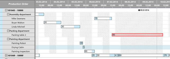
All NODES LOOK THE SAME WITH ONE EXCEPTION: THE RED HATCHING INDICATES THAT THE ACTIVITY‘S END DATE IS PAST THE DUE DATE.
Instead of changing the color resp. the appearance of the bar, you can also add symbols to the bar which provide you with context-sensitive information.
THE TRIANGLE REPRESENTS THE DUE DATE.
GREEN = ACTIVITY FINISHED IN TIME. RED = ACTIVITY RUNNING LATE.
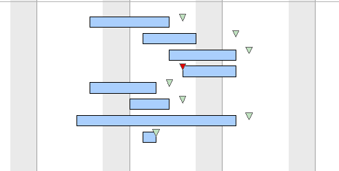
Of course, you are not limited to one form of hatching per Gantt visualization, and you can combine hatchings and symbols. However, we strongly recommend that you limit the number of visual alerts you use. Remember: you want to use them to show the critical exceptions in a schedule and they should indicate the tasks that need your user’s immediate feedback. You will not achieve this if every task is marked critical.
THREE VISUAL ALERTS IN ONE GANTT . THE DIFFERENT HATCHINGS INDICATE THE LACK OF DIFFERENT MATERIALS FOR THIS SPECIFIC PRODUCTION ORDER. THE RED TRIANGLE AGAIN GIVES AN „OPERATION TOO LATE“ WARNING.
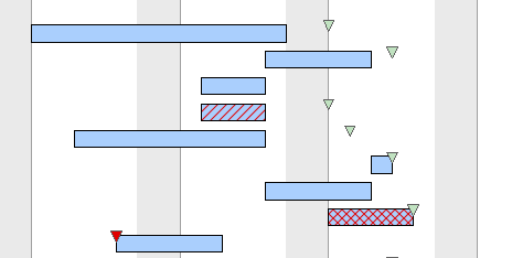
Finally, you can also use additional layers to point your users’ attention to critical elements of the schedule represented in the Gantt diagramm. Again, you are not limited to one layer per node, but can apply various layers. But please keep in mind that you should not overload your Gantt scheduling application with too may visual alerts. Always limit your alerts to these incidences which are crucial for your business.
ONE RED LAYER INDICATING AN ISSUE, E.G. A MACHINE CONFLICT
Tip 2: Apply user alerts also to the Gantt diagram table
As compelling as warning colors or warning layers are, they face one inherent weakness: they are only visible when the actual bar is visible on the screen. However, sometimes Gantt diarams have to master the spread of providing a high level picture and delivering very detailed information.
Hence, many of our customers use their charts both for a rough-cut planning and the detailed planning. In the rough-cut planning, they look at their e.g. production schedule with multiple weeks or even months timeframe, whereas in the detailed planning they focus days or hours. Of course, in the detailed view, color alerts on the bar-level play an important role.
Well, these information though get lost in the rough-cut planning as the users never see all nodes on one screen. Hence, we highly recommend to include decision-relevant information such as delivery time commitments as indicator fields into the table part of the Gantt application.
HIGHLY RECOMMENDED: WORKING WITH COLORED USER-ALERTS IN THE GANTT DIAGRAM TABLE. ESPECIALLY USEFUL FOR ROUGH-CUT PLANNING.
Tip 3: How to visualize the percentage of completion
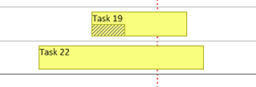
A Gantt always visualizes time-related planning data. We regularly observe use cases, in which the percentage of completion of a specific job or task is an important information for the planer.
A recommended best practice to visualize the percentage of completion is to add an “informational” layer on top of the task layer. There are various alternatives which can be chosen as you can see from the below examples. We advise that you decide upon these layers in combination with the design of your “alert layers” so that your Gantt chart highlights especially those information that is relevant for your users.
Option 1: A tall percentage of completion layer on top of the task layer
Option 2: Use a Different „Fill color“ of the Task Layer to visualize the percentage of complete
Option 3: Individually designed percentage of completion layer
If you develop Gantt charts especially for the process industry, these layers may be misleading. Many users in the respective verticals do not think left-right, but they think bottom-up: for them, percentage of completion typically equals a fill level. In these cases, we recommend the following visualization.
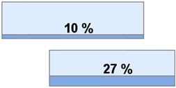
Option 4: Percentage of completion layer indicating a fill level
These are just three tips how to use colors to add intelligence to your Gantt scheduling applications. Want to get more ideas how to use colors to spice up your Gantt diagrams? Download the free Ebook: